Frishka
One of the most legendary street-food kitchens in Novo-Lenino. Full rebrand and high quality visuals.
They keep winning “Best street food in Leninsky District” awards from 2GIS. That’s how good they are.
Before I came to work with them, their food was already excellent and award-winning. But now, the visuals actually match the quality of their offer.
From an updated and modernised logo that didn’t lose any of the original’s DNA, to the new expanded brand book and design system, as well as high quality photos, the brand is stronger than ever.
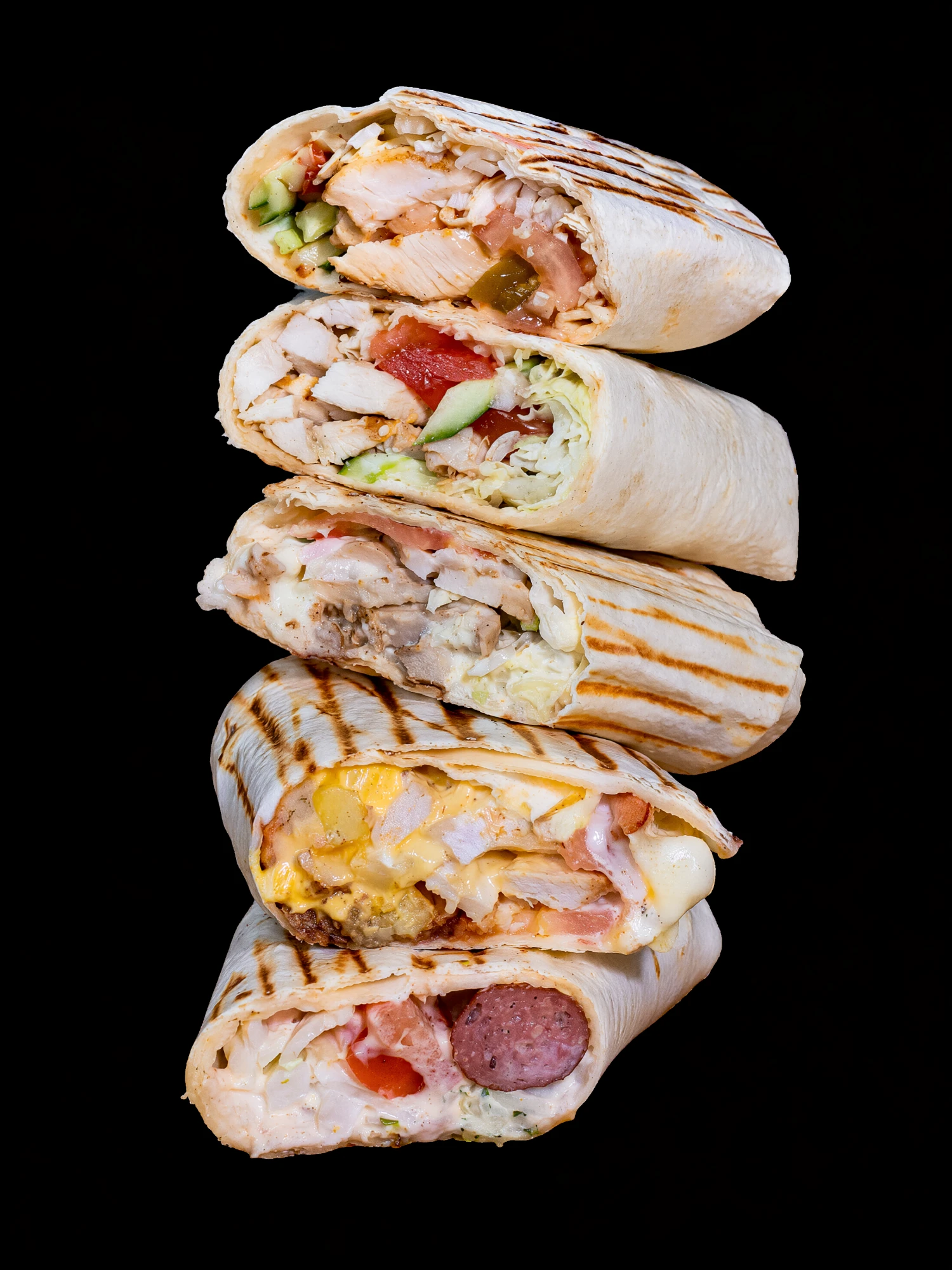
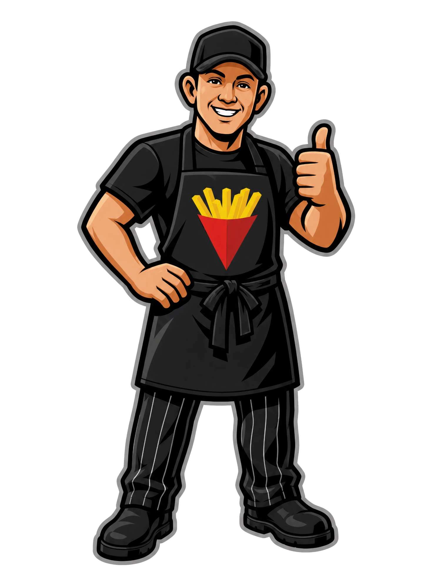
Product on black, and the mascot that came with the new identity.
Flexible, modular photo techniques.
My favourite trick up my sleeve is making photos that can be reused everywhere and quickly become iconic, to the point of being the literal face of the brand.
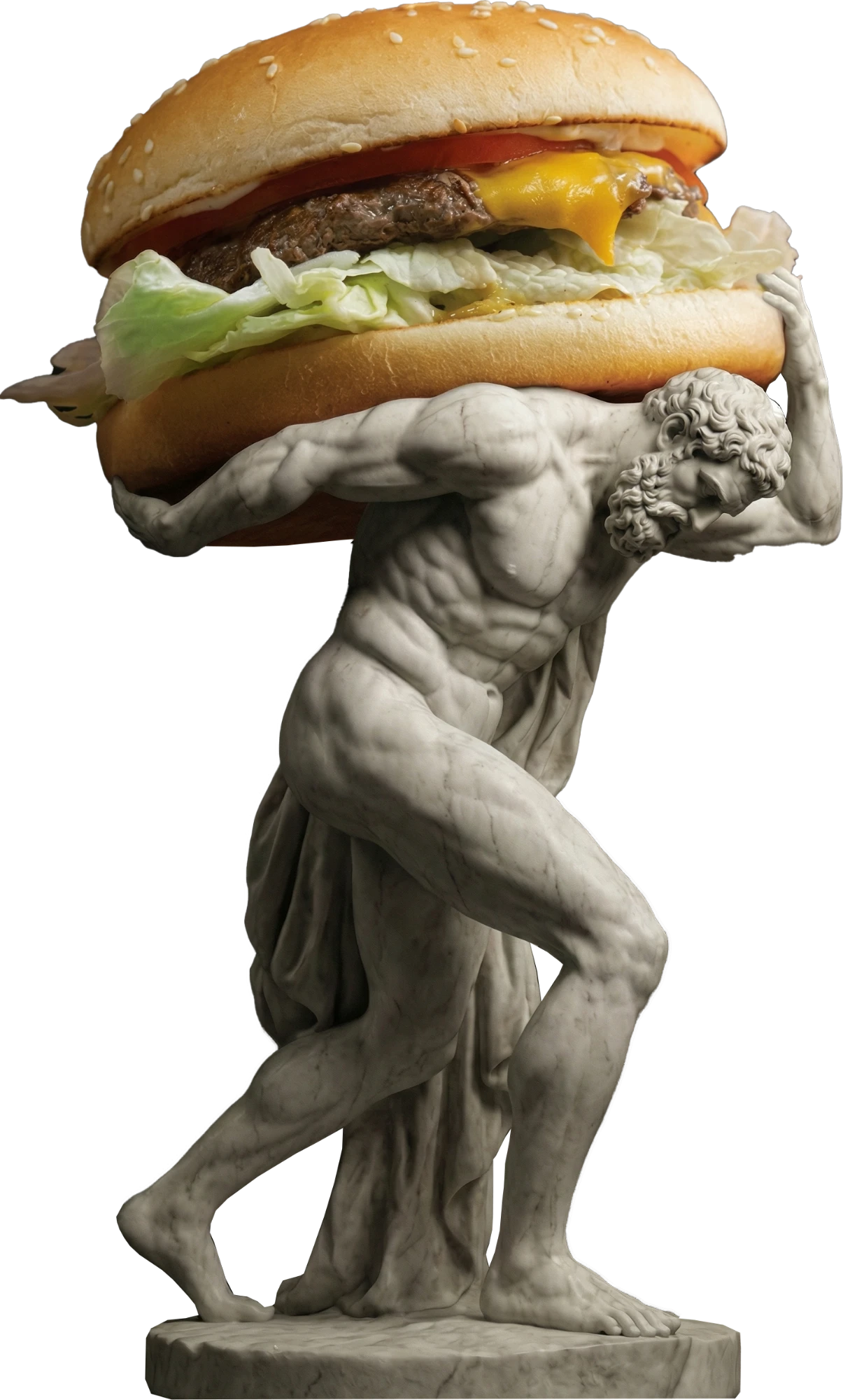
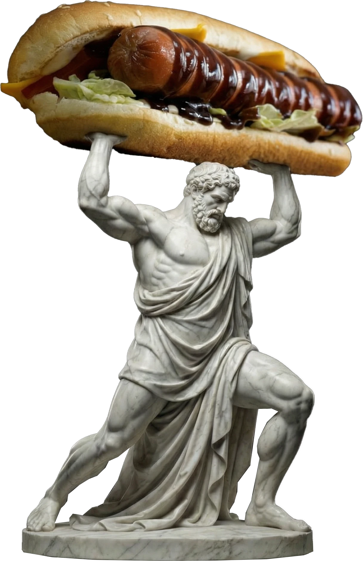
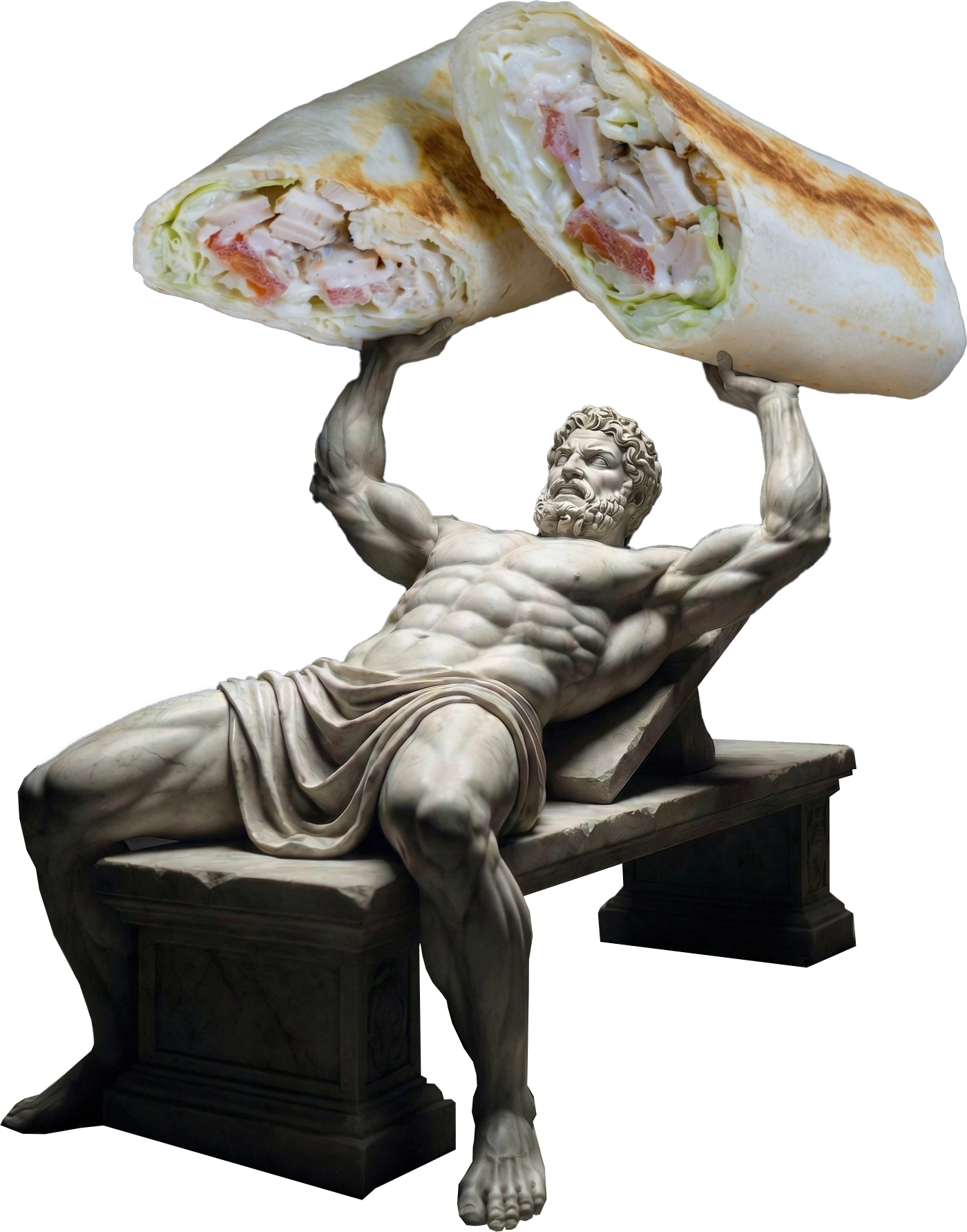
Campaign key visuals: burger, hot dog, shawarma.
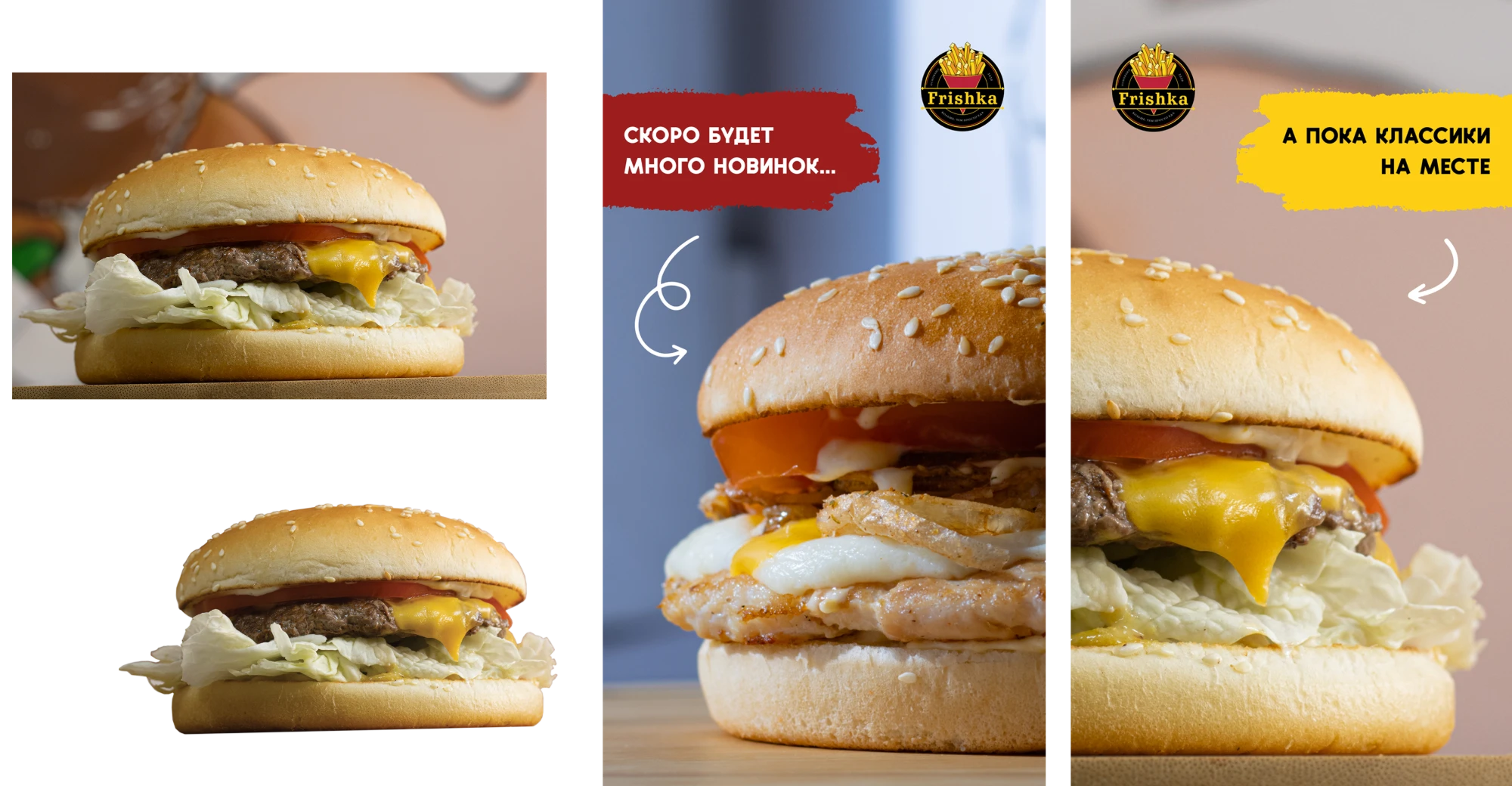
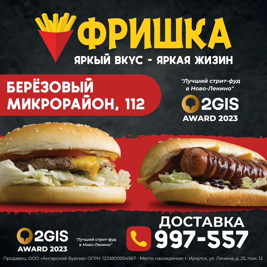
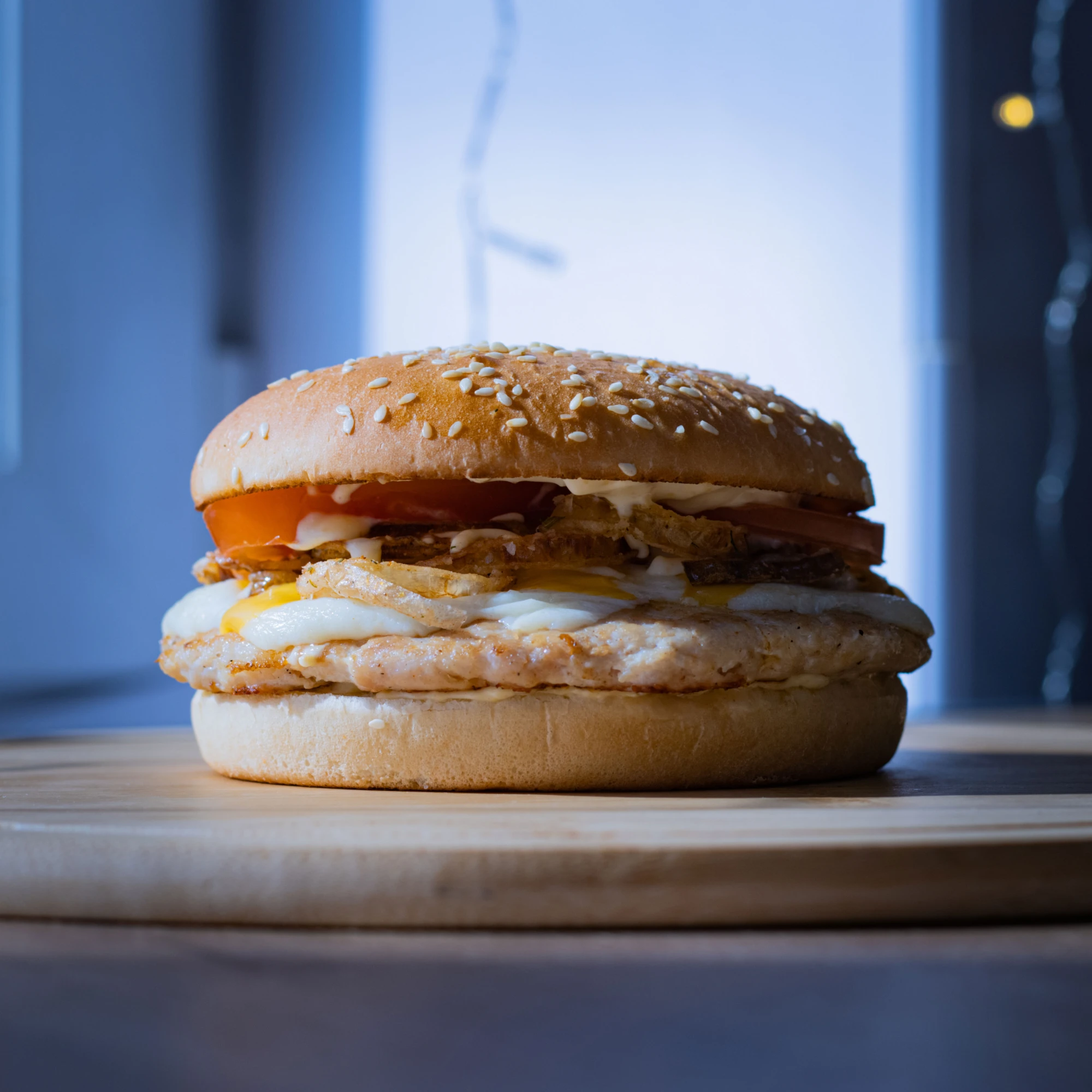
Stories, a delivery post and the new chicken burger.
Accent on legibility.
I always hated those monotone menus where you can’t really see the difference between sections. Here, I noticed people pick their food very fast. The colour combo is based on colours that actually connect to the food and make people hungry — with green, of course, pointing to the healthier alternatives (boxes with vegetables, or salads).
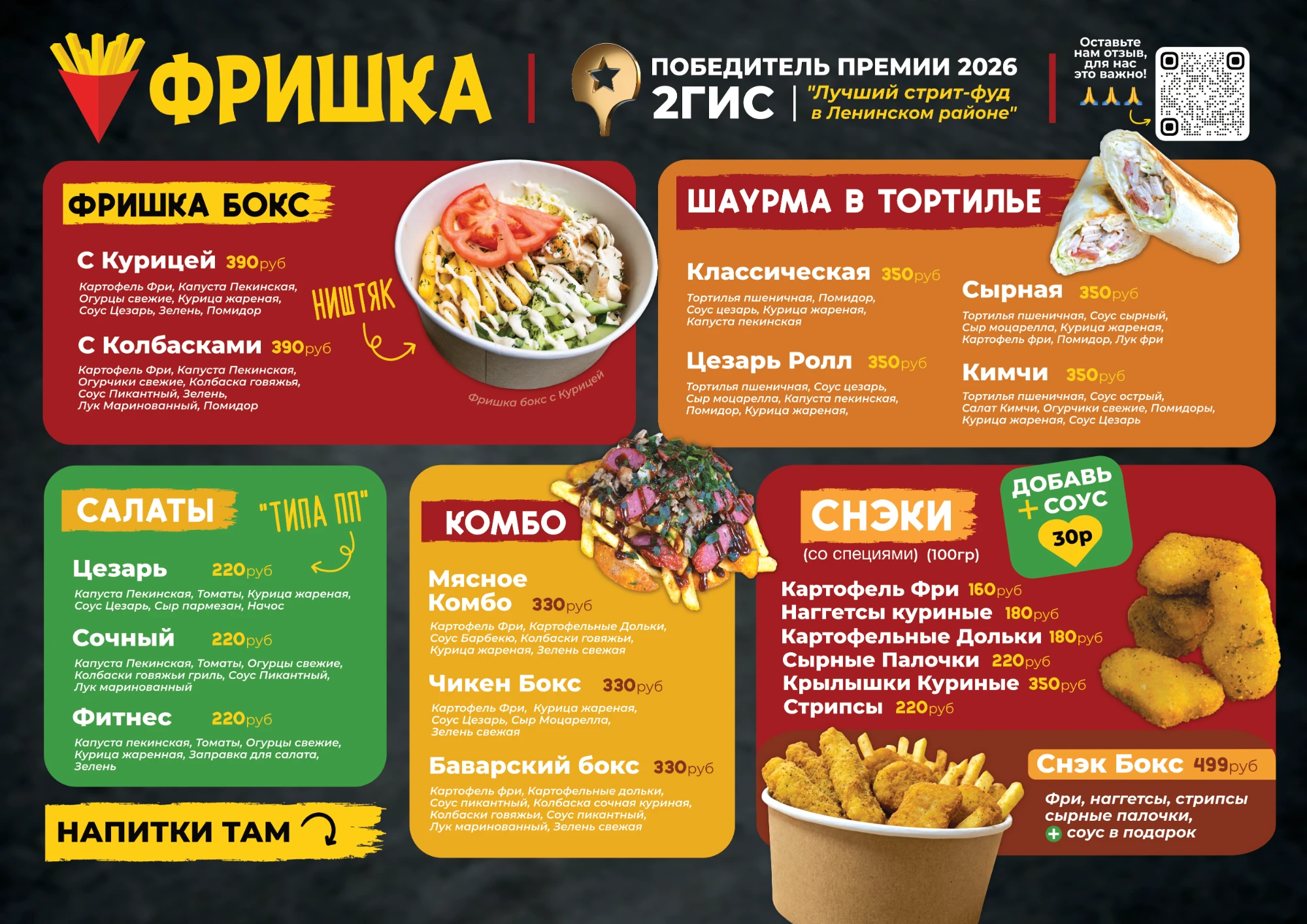
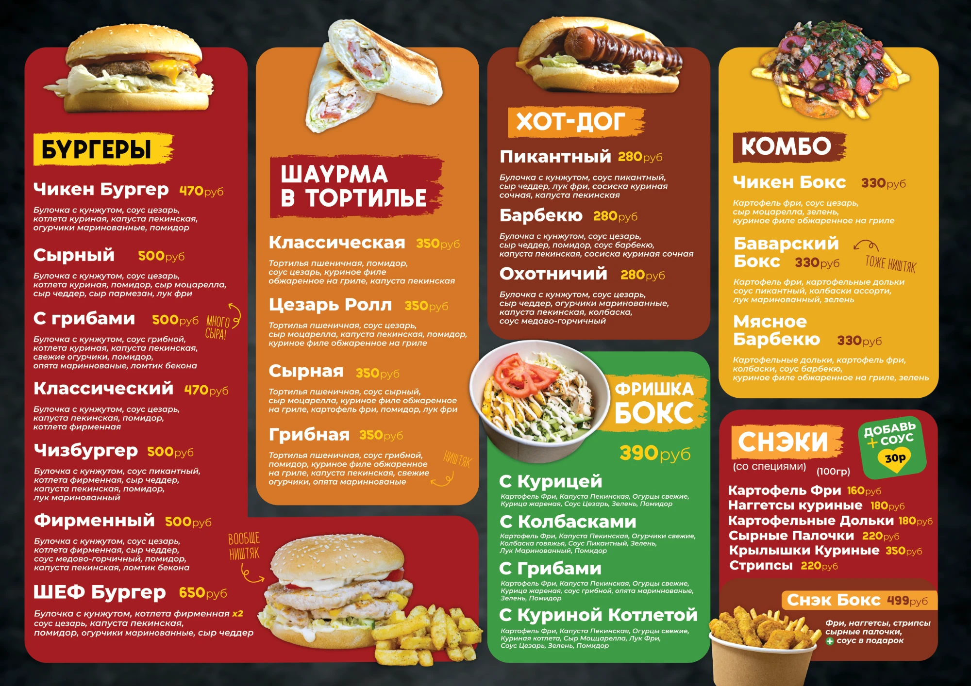
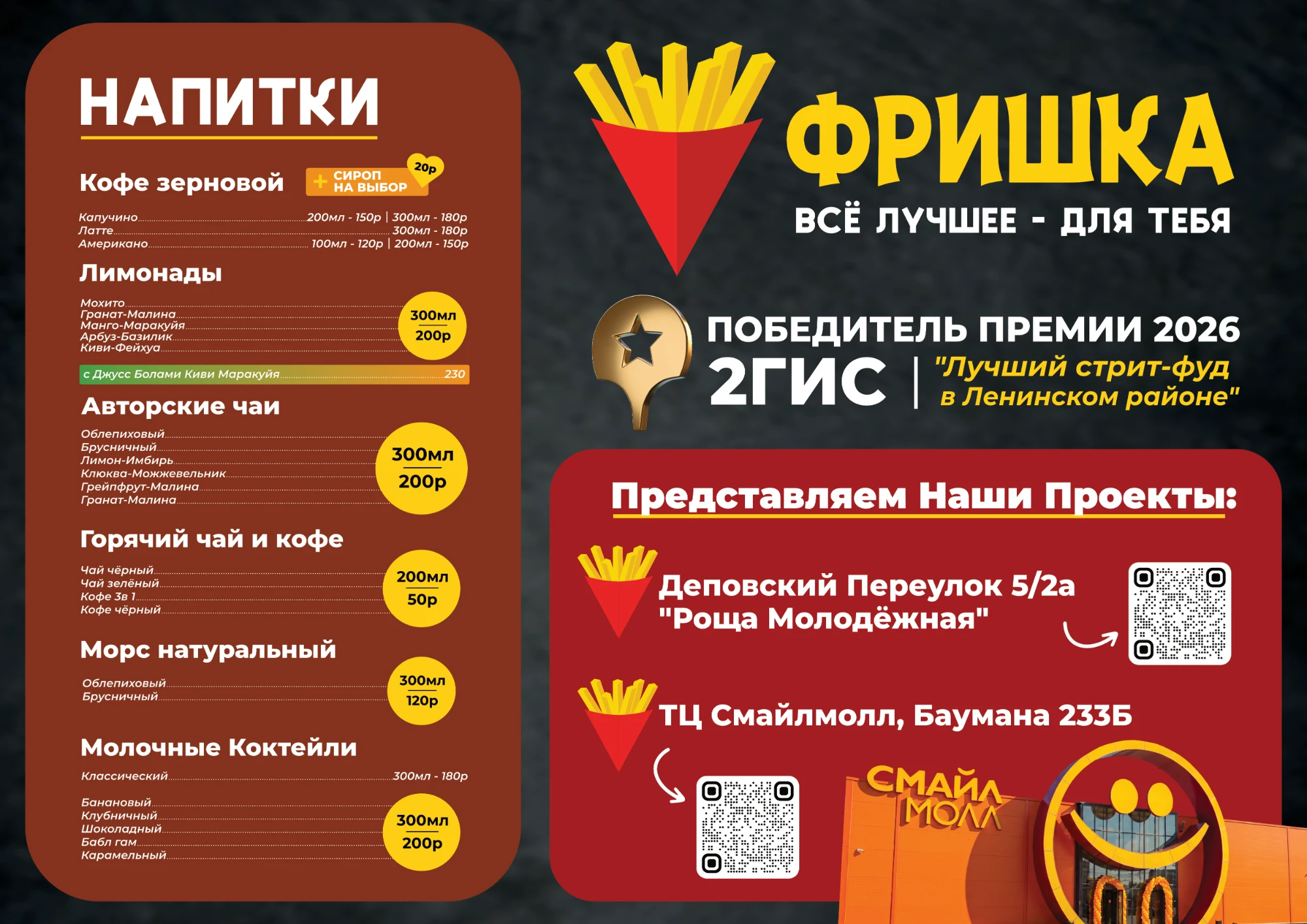
Food board, main board, drinks board.
Design system expanded for digital use.
There is an app on the way. I can’t tell you more, but here are a few screens I designed and got the logic approved for (the final app might look different).
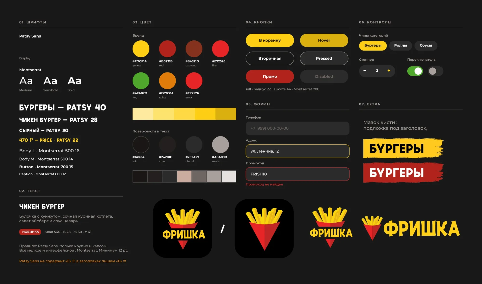
The design system: type, colour, buttons, forms, controls and the brush-stroke headers.
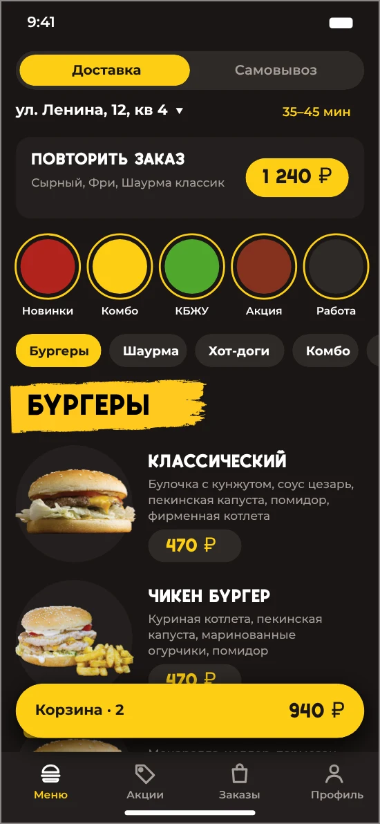
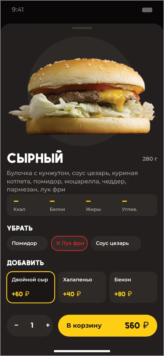
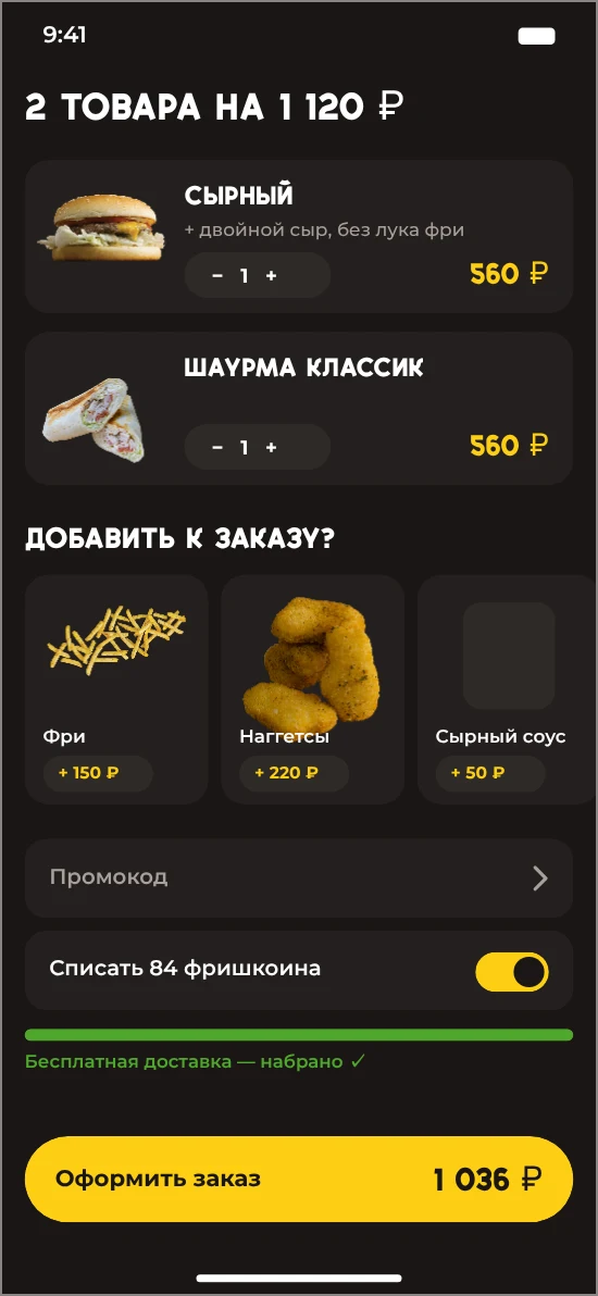
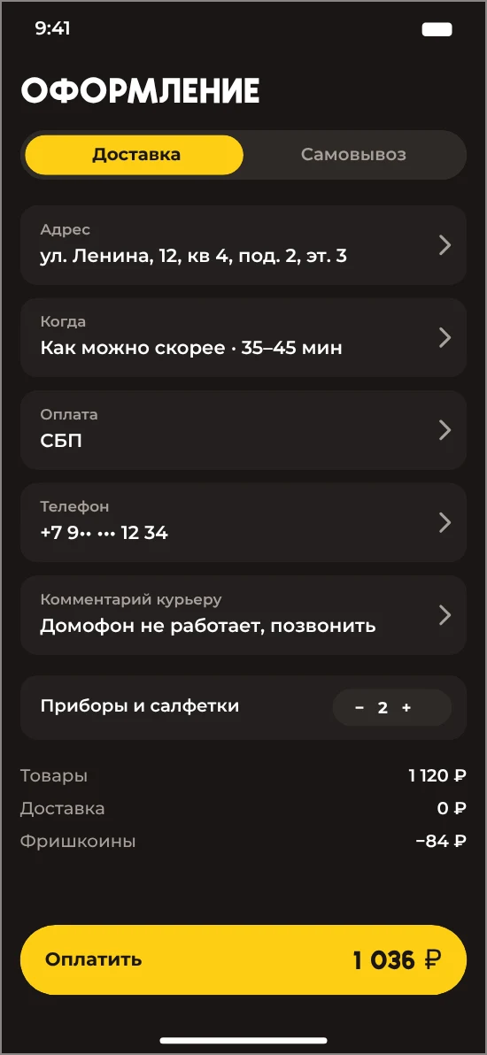
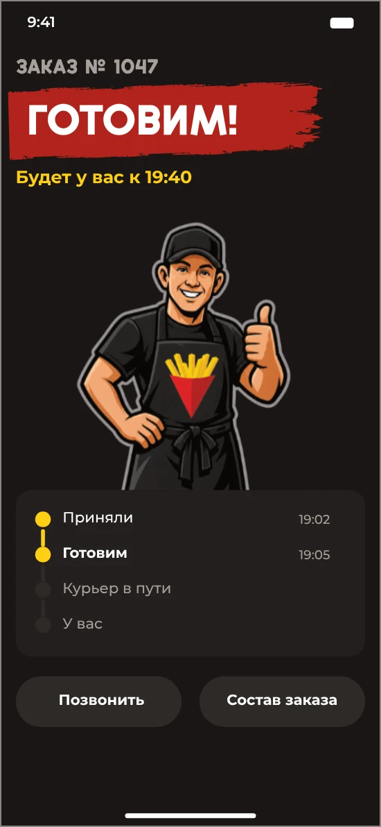
Menu, product card, cart, checkout and order status.
Iconic shots.
Background, table corner — these shots aren’t perfect from a photographer’s point of view, but the way I captured the food, I know you’re salivating just looking at it. I literally cannot take my eyes off that burger!
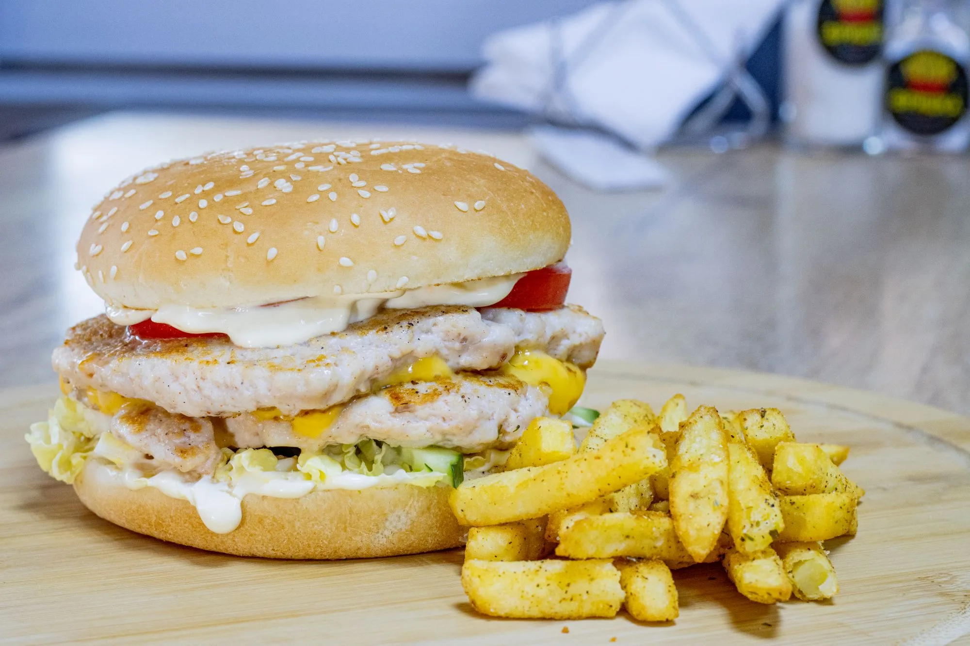
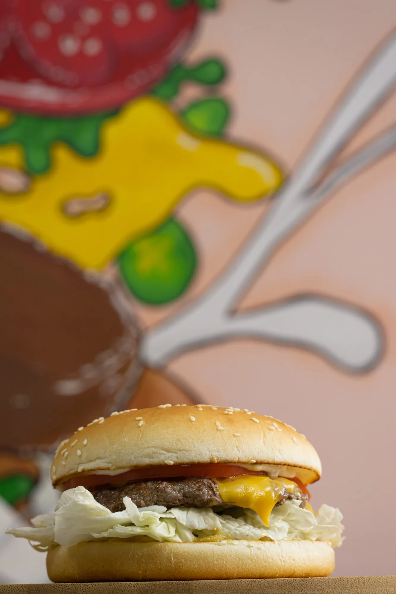
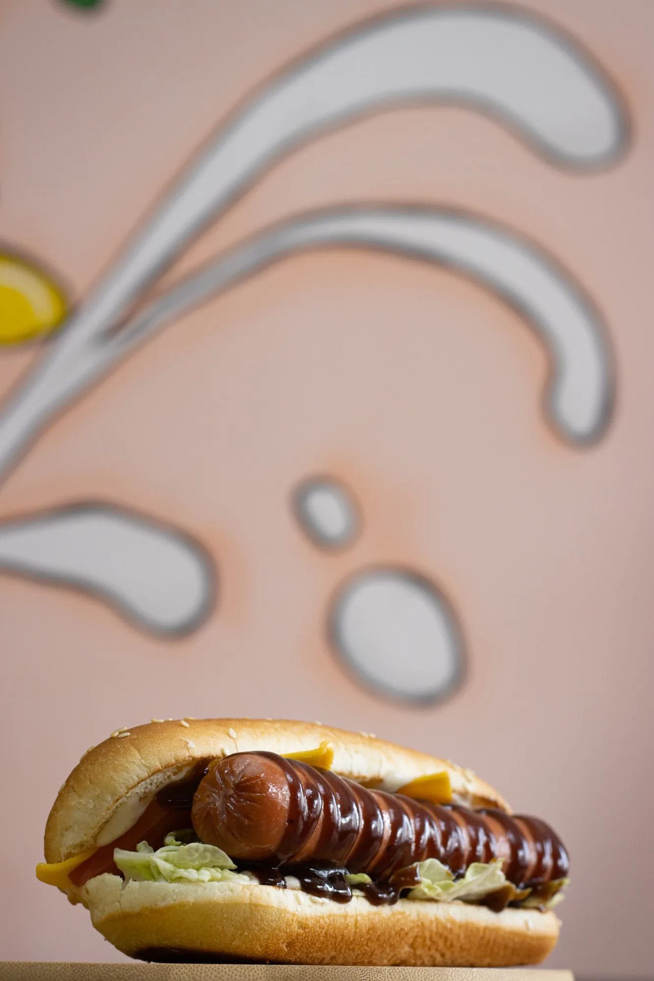
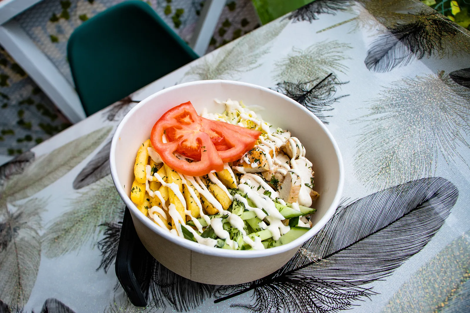
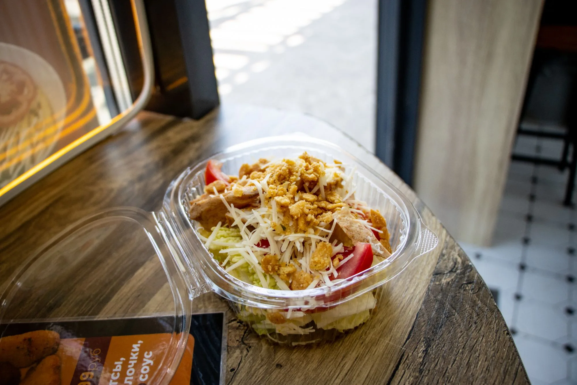
Frishka Box and Caesar, shot in the restaurant.
Digital menu for all the platforms.
The design system flawlessly adapts to any format, and never looks out of place.
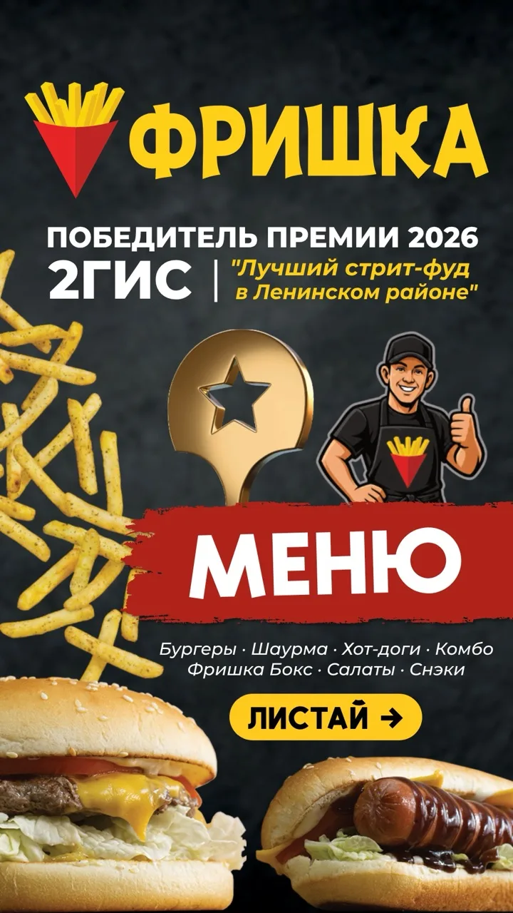
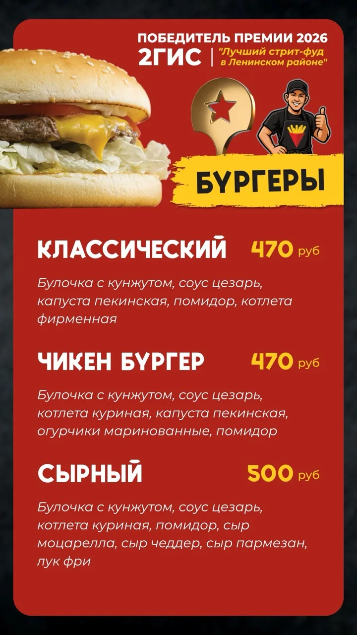
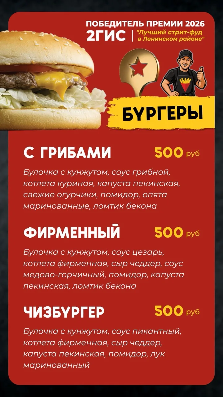
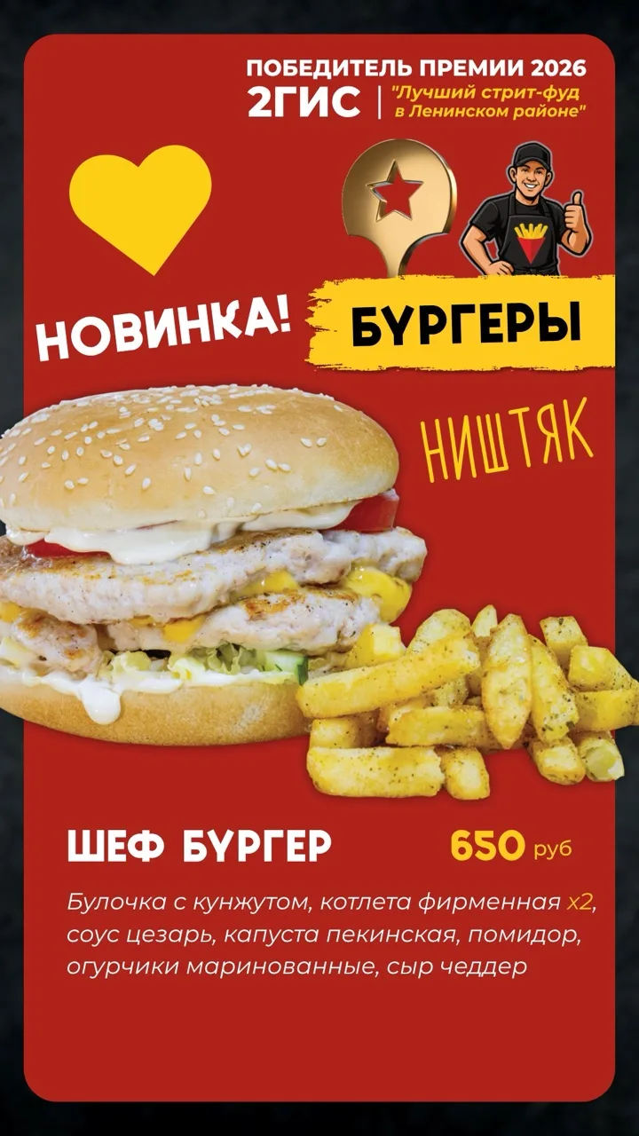
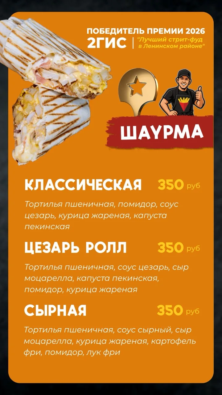
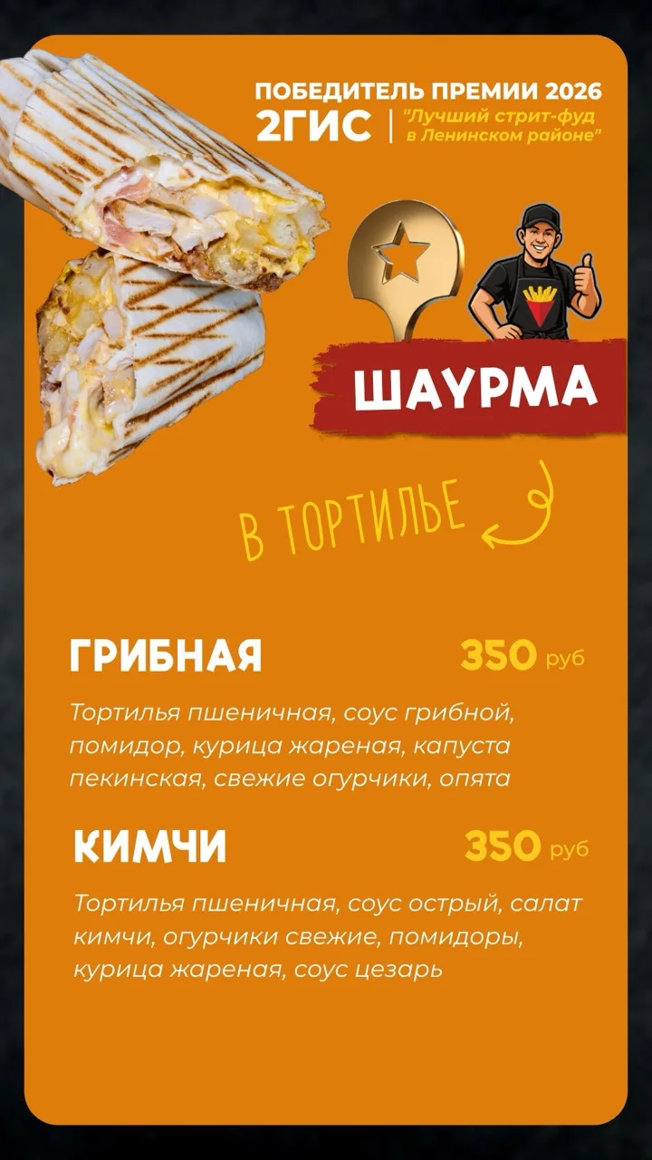
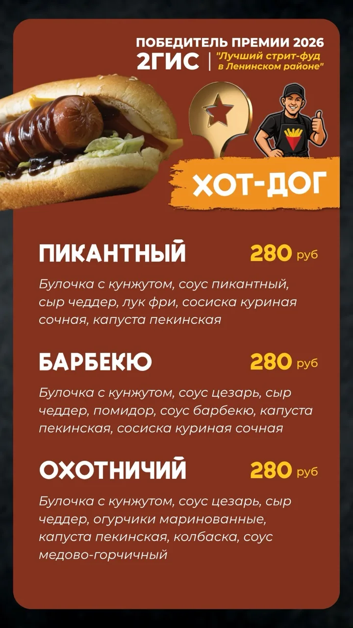
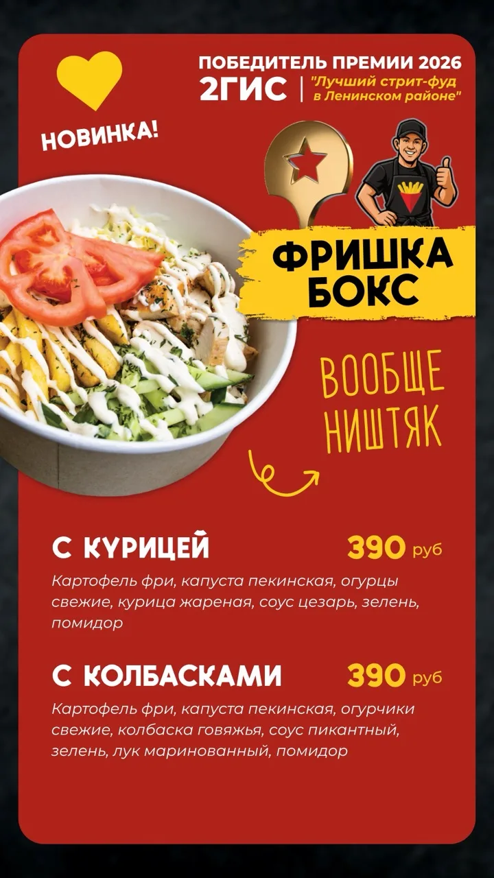
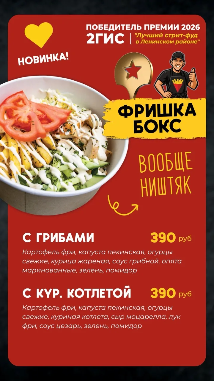
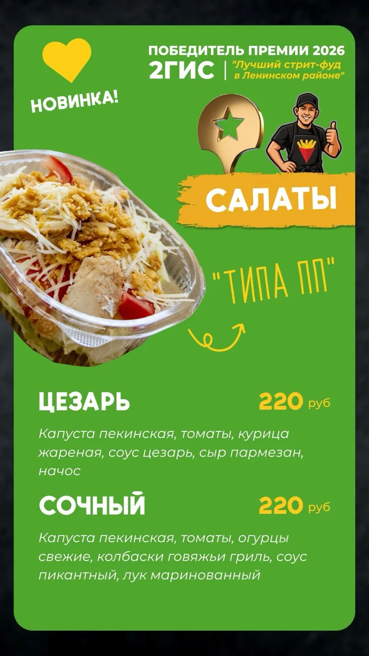
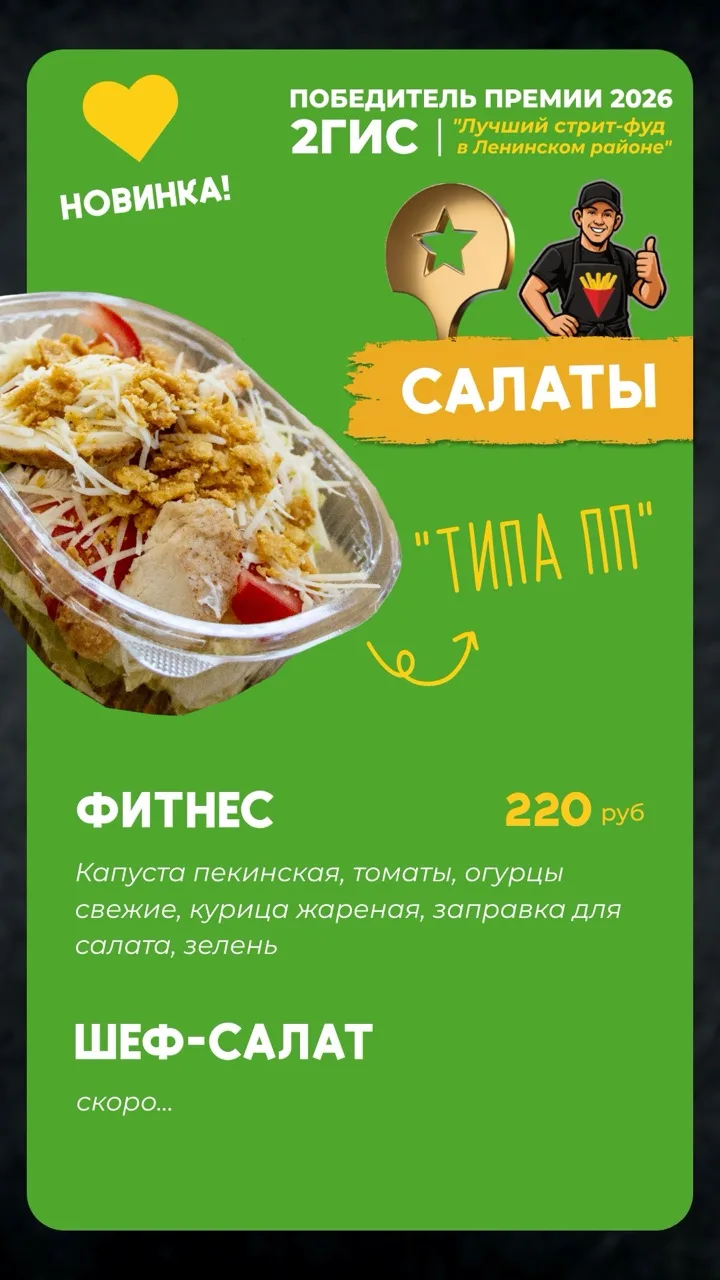
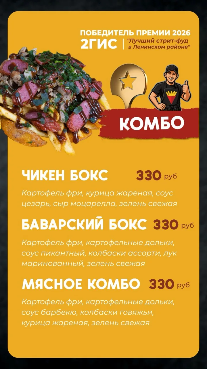
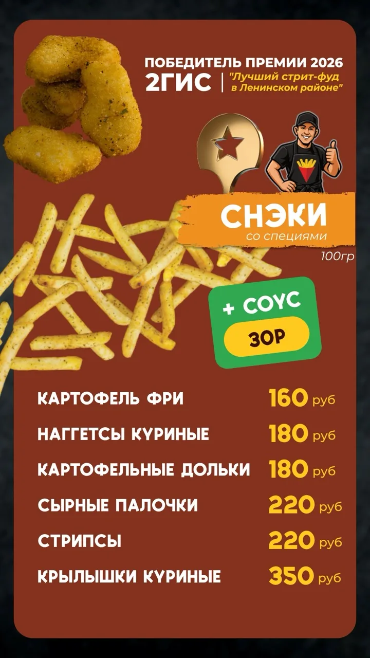
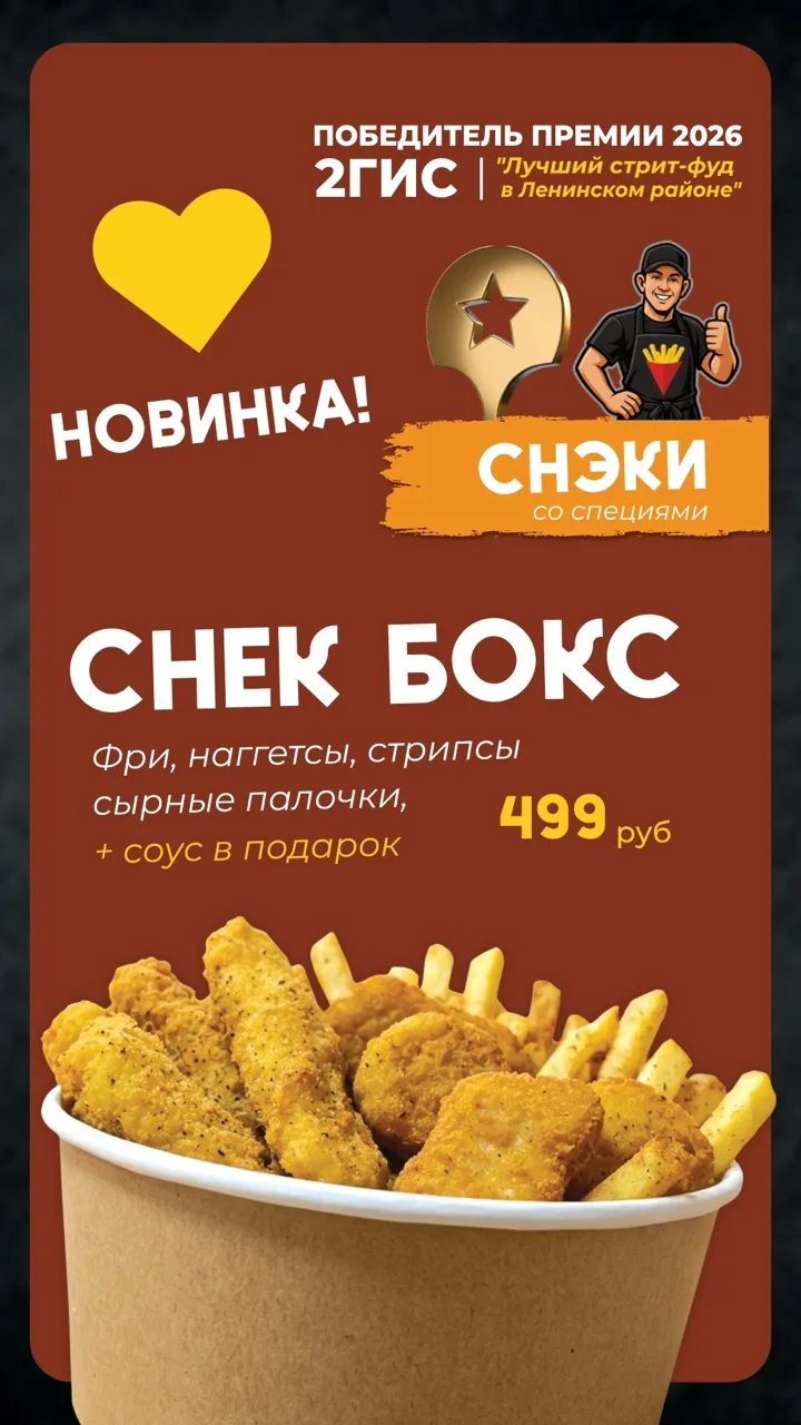
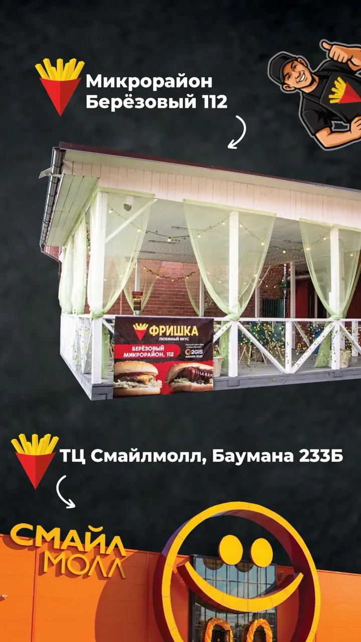
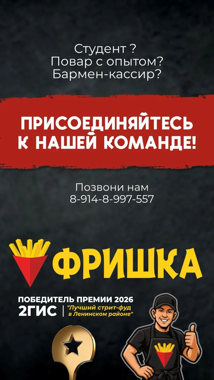
Menu stories: one per category, sixteen frames.
So, yeah.
I guess you already understood that this was probably one of my favourite projects. A lot of people get tired of my strict sense of ethics, but the owner of Frishka, Artiom, is actually the same. He has principles, strict discipline in his work and systems, and believes in his strategy. He loves what he does — and everyone can tell. Working with them is always a pleasure, and we have weekly check-ups to adapt or change things on the fly.