Greenique
Greenique is the second brand of the Davim Maslo group, taking a new direction with new products and new vibes.
Alchemy, nature, and his muse.
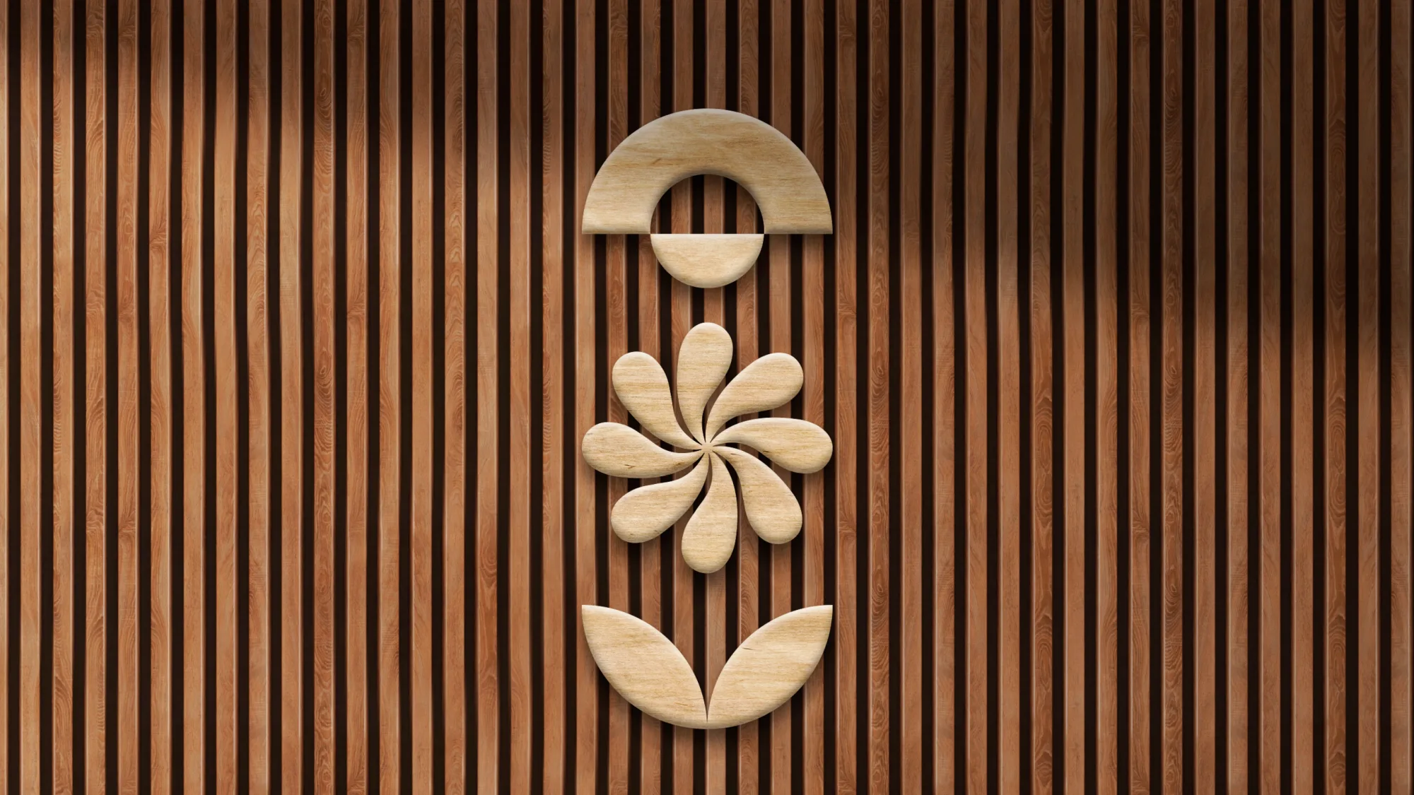
The logo uses simple shapes that, once combined, tell a story and hide a meaning: set vertically, they look like a Russian woman.
Olimpia, the brand owner’s wife, has always been his muse, and this logo pays homage to his love for her.
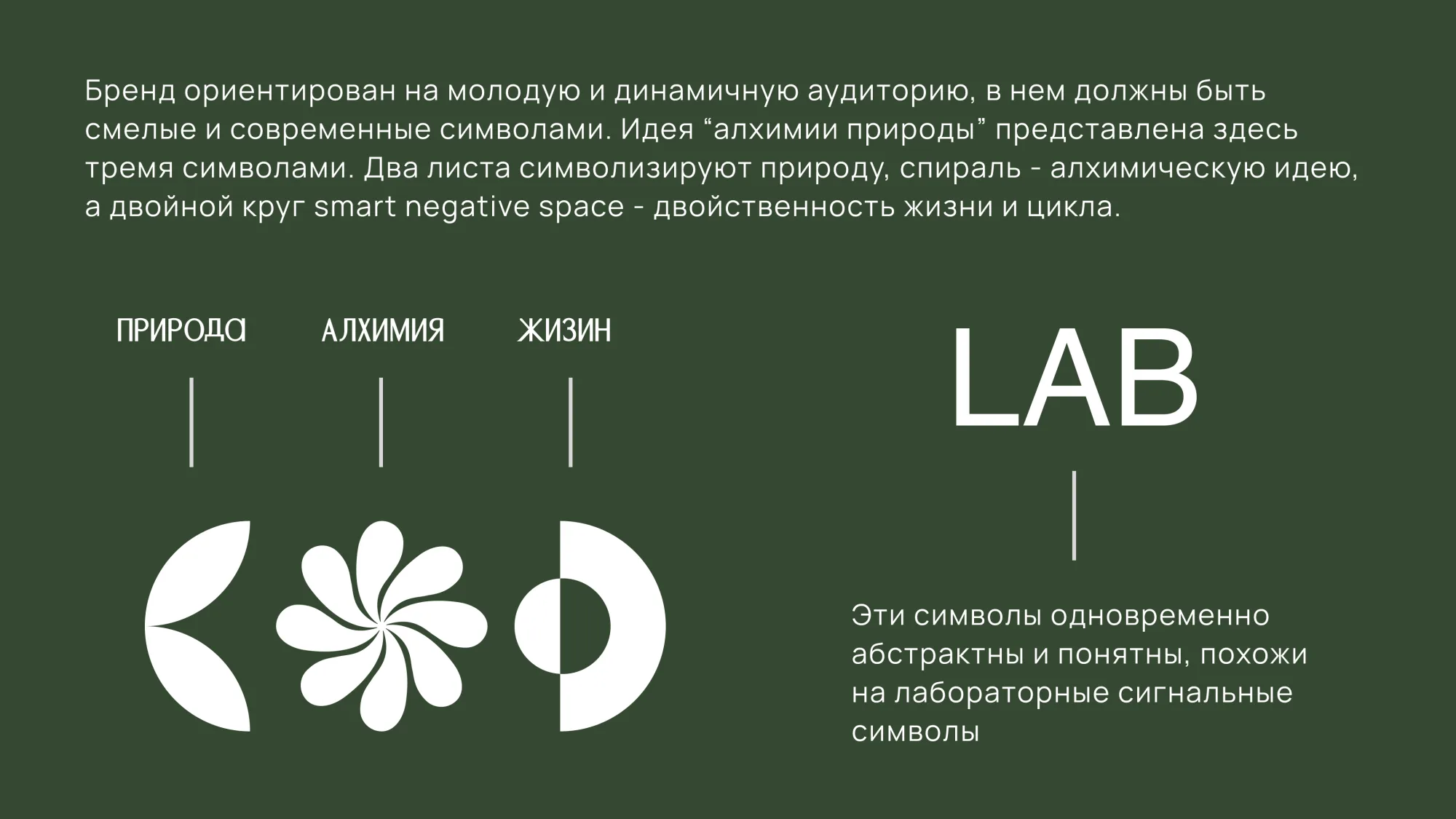
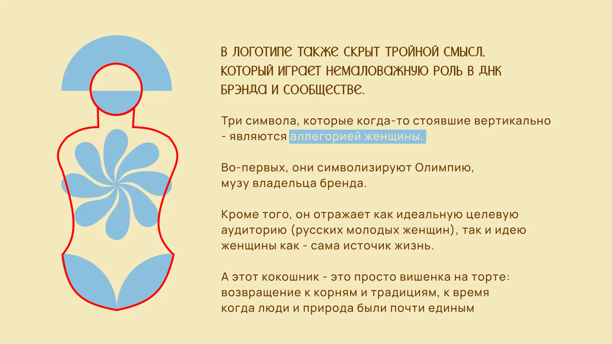
Nature, alchemy, life — and stacked upright, the figure of a woman.
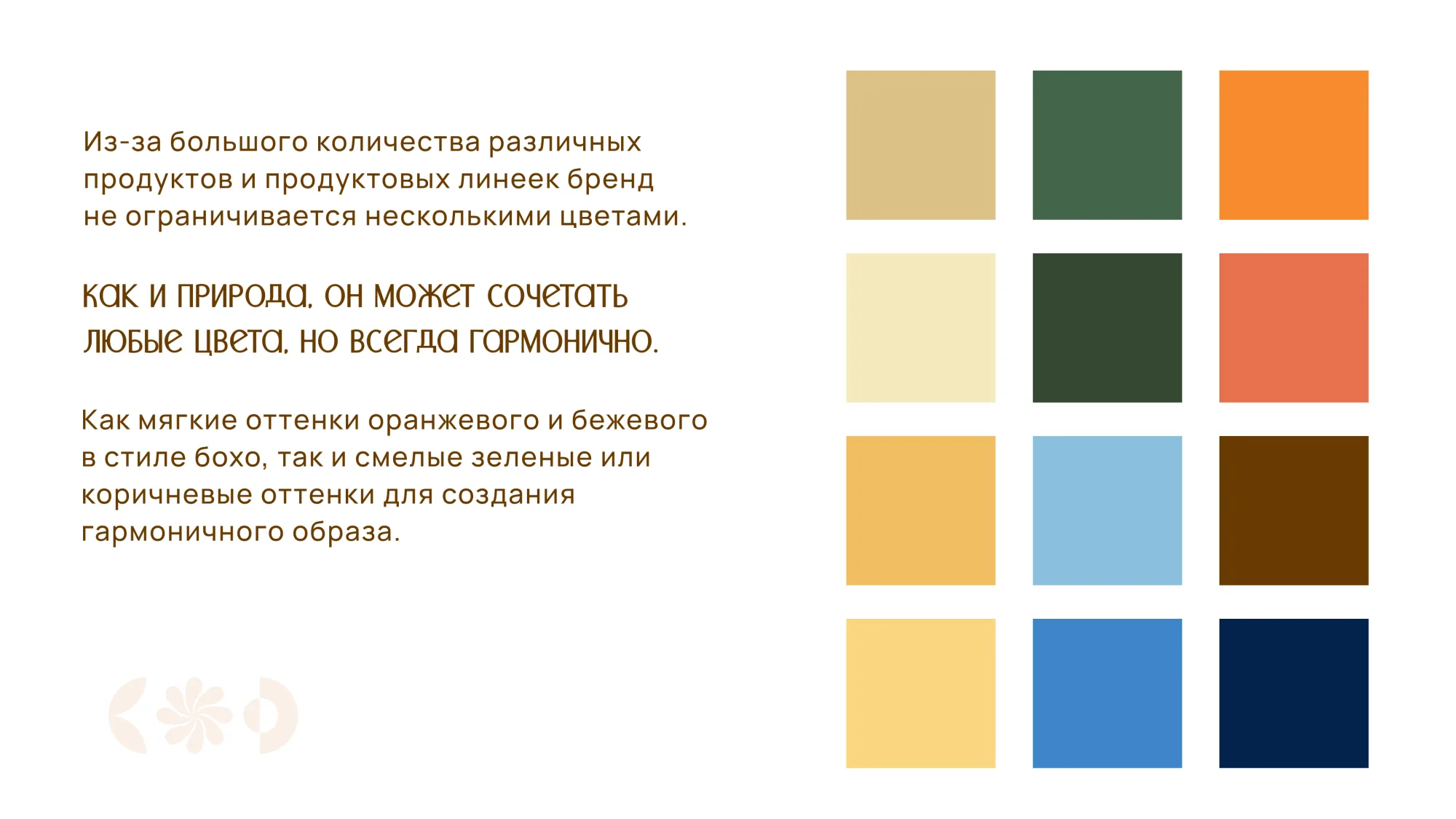
Boho oranges and beiges next to bold greens and browns: like nature, any colour works if it's in harmony.
High impact infographics.
The owner generated the stickers for the packaging himself, and he did a great job, especially with the colour combinations, which translate very well into the infographics I made (the tea photos aren’t mine: I made the layout and generated the supporting graphics).
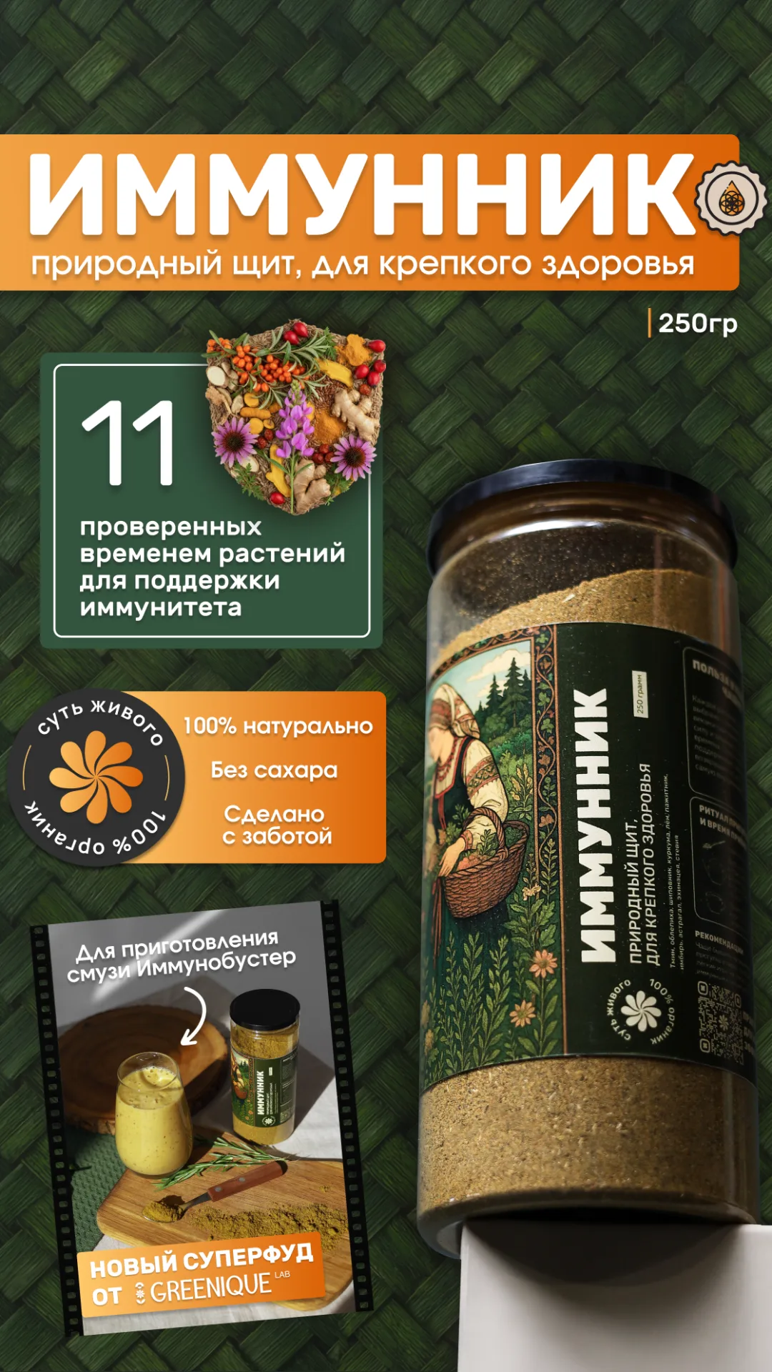
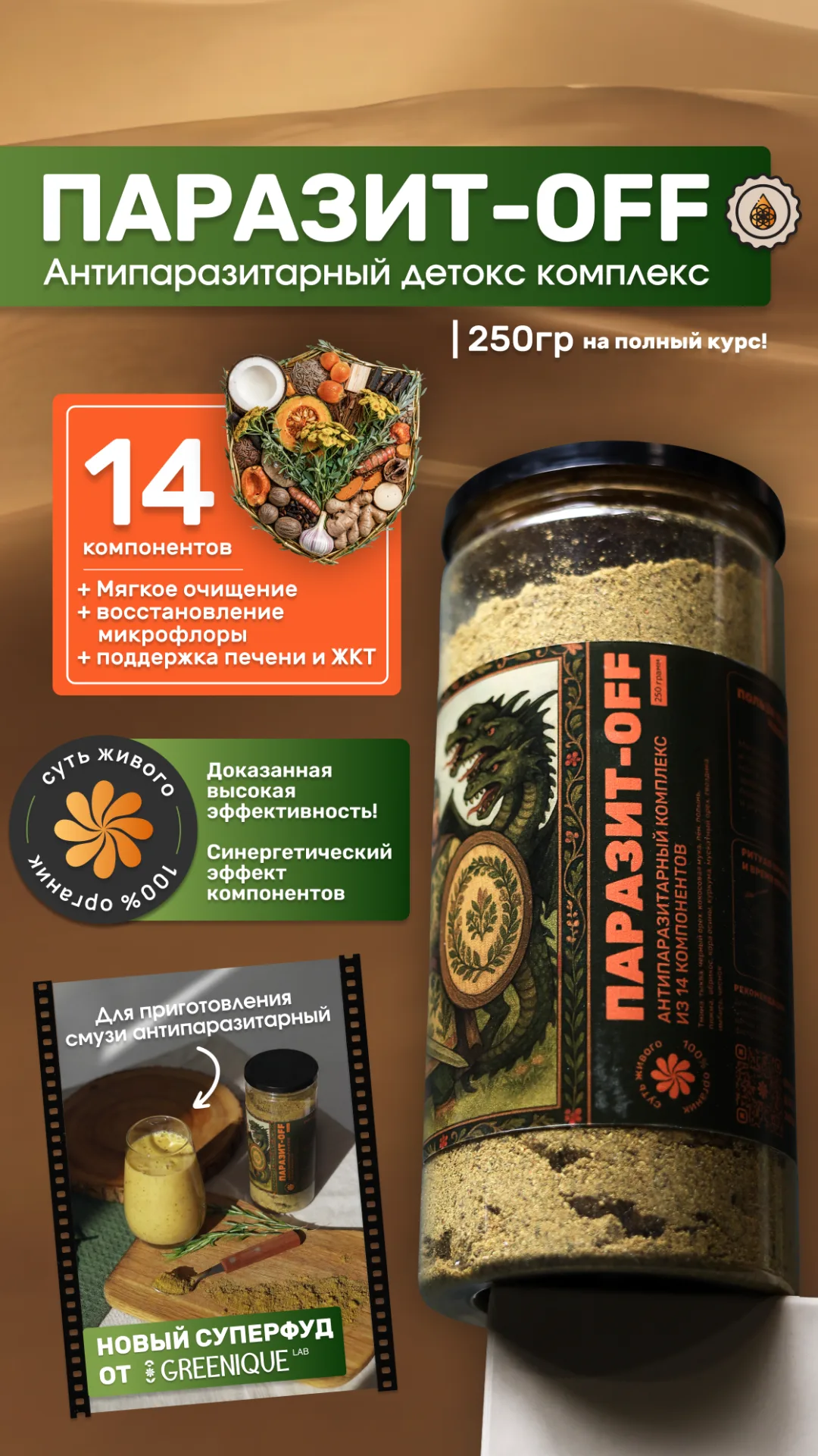
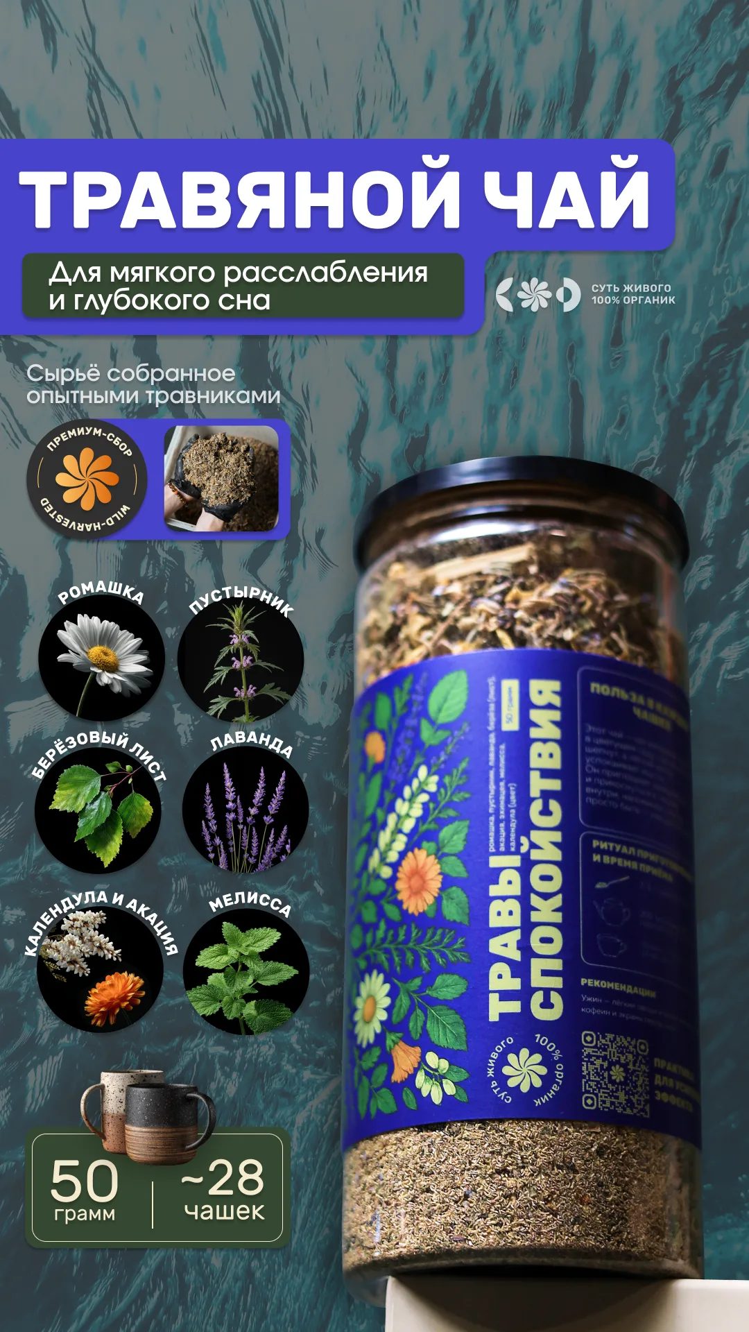
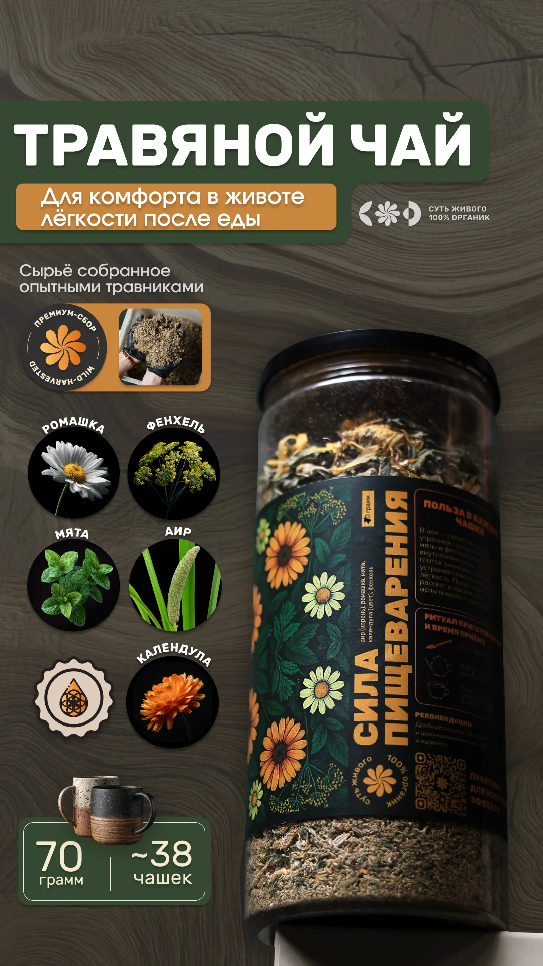
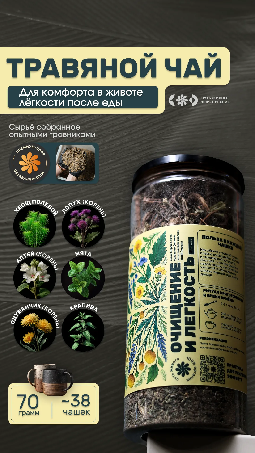
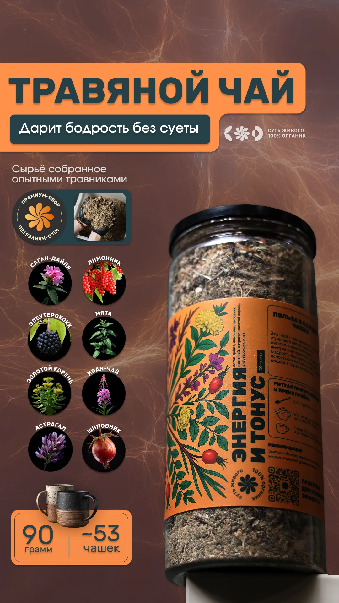
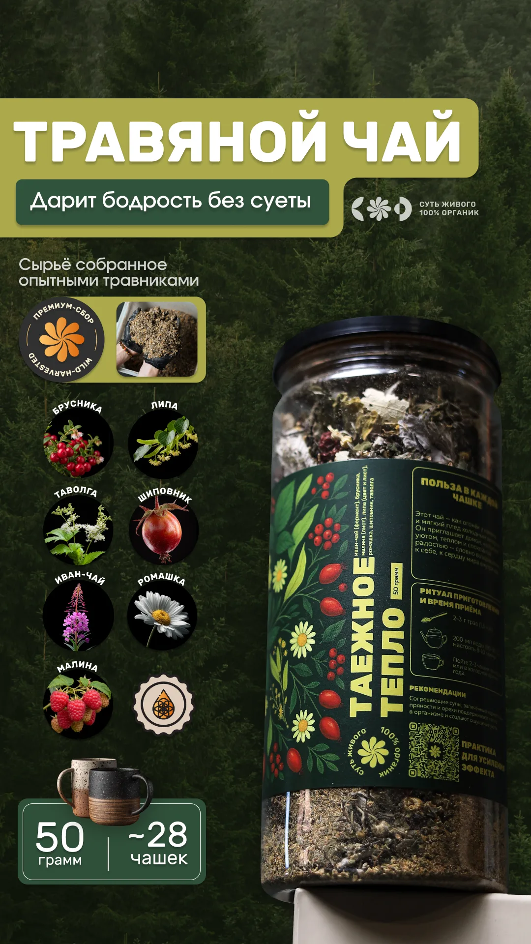
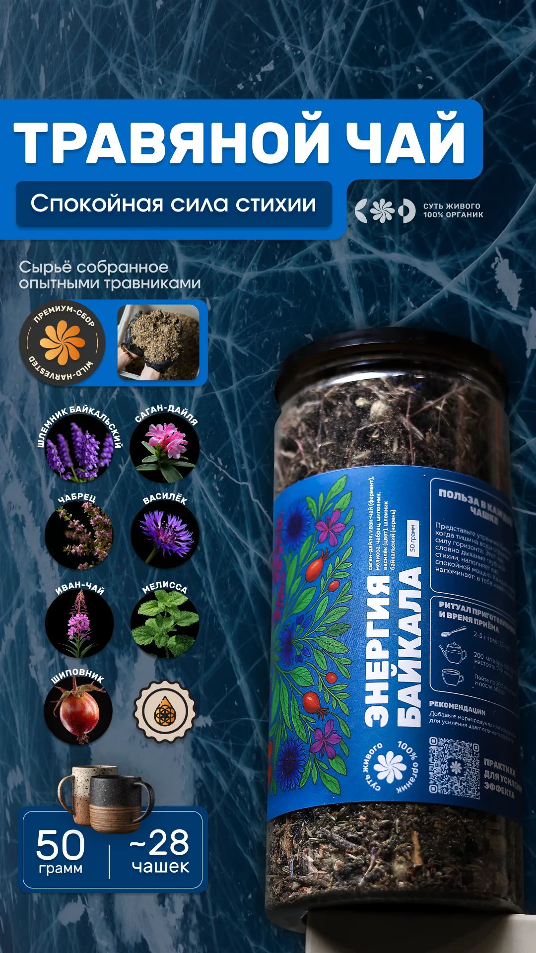
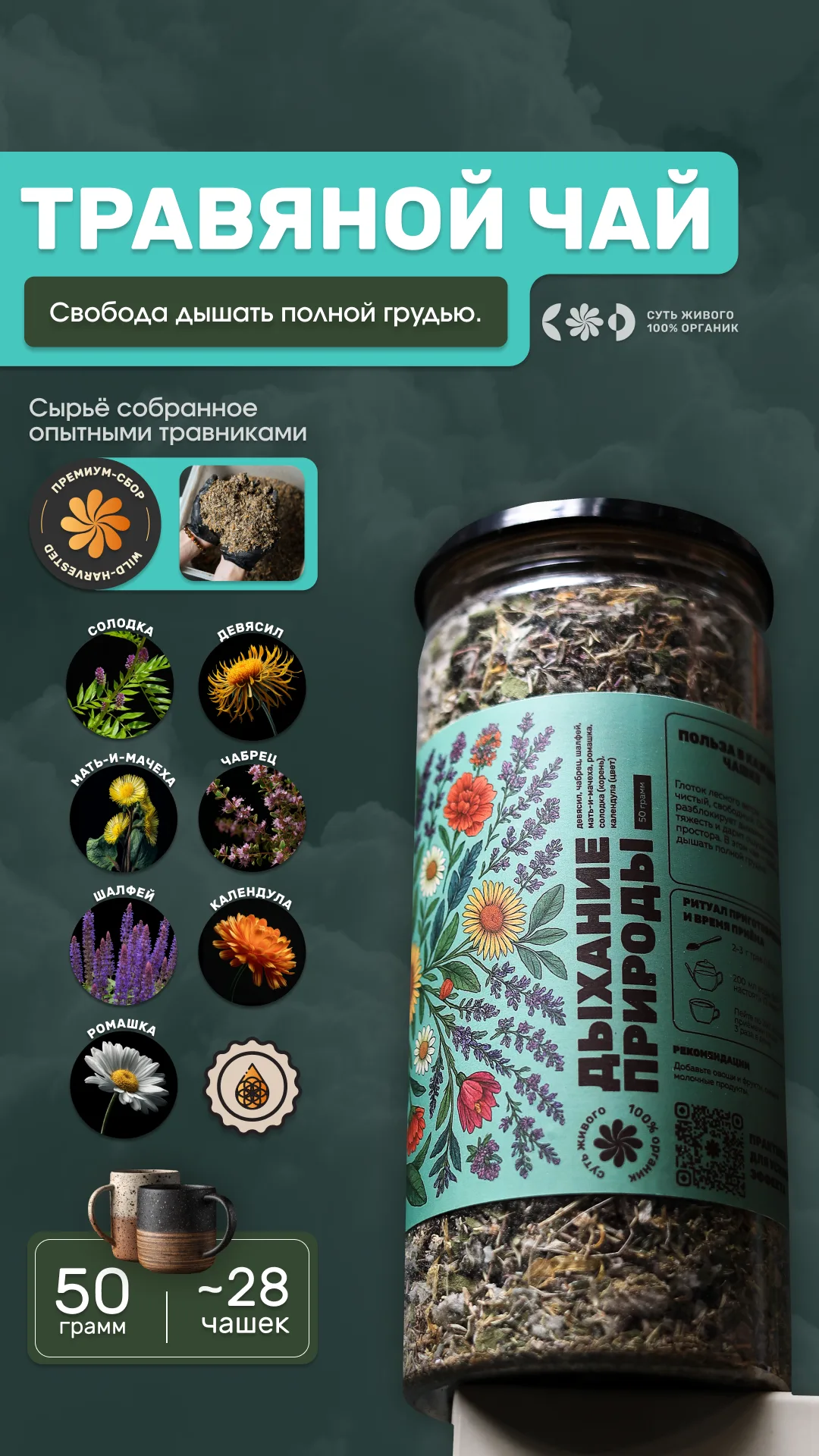
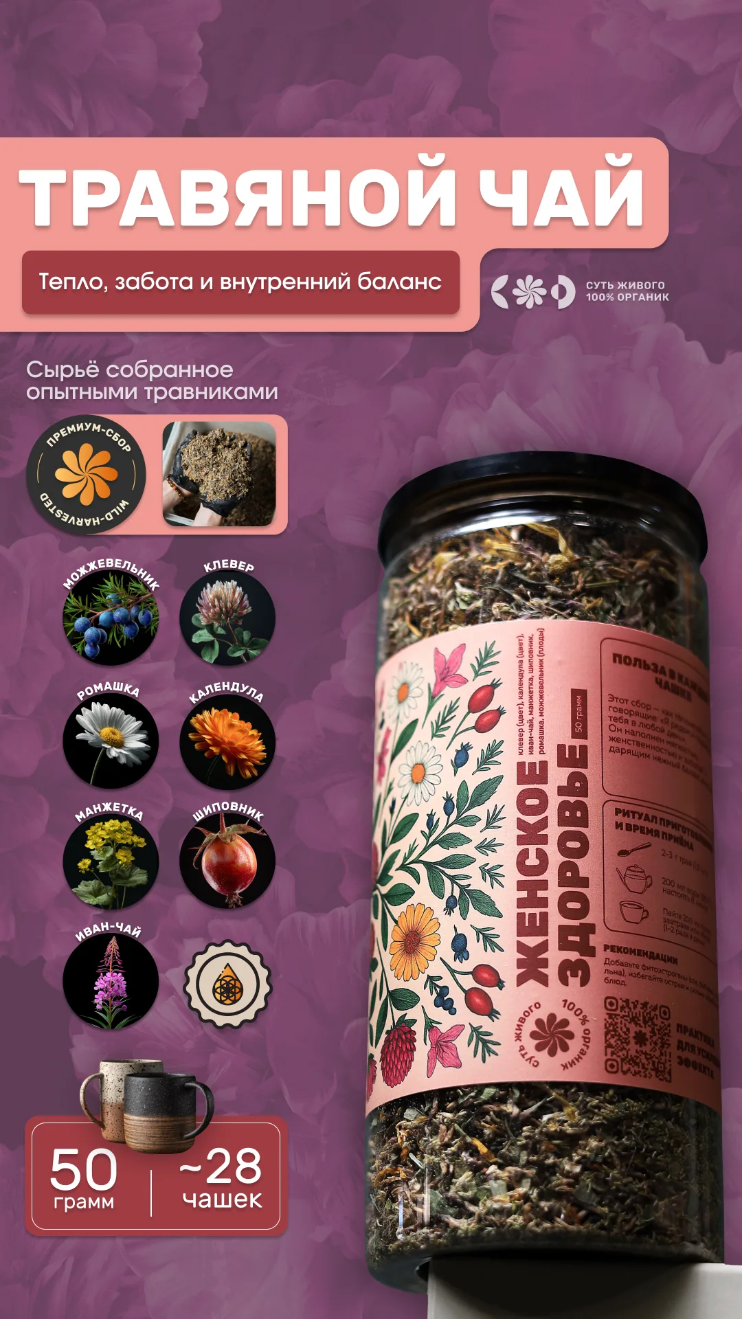
Stories for the range: Immunnik, Parasit-OFF and nine herbal teas.
Small text, big meaning.
It’s always hard to explain something in depth with a small amount of text, but looking at how this turned out and the meaning it conveys, I’m pretty happy with the result.
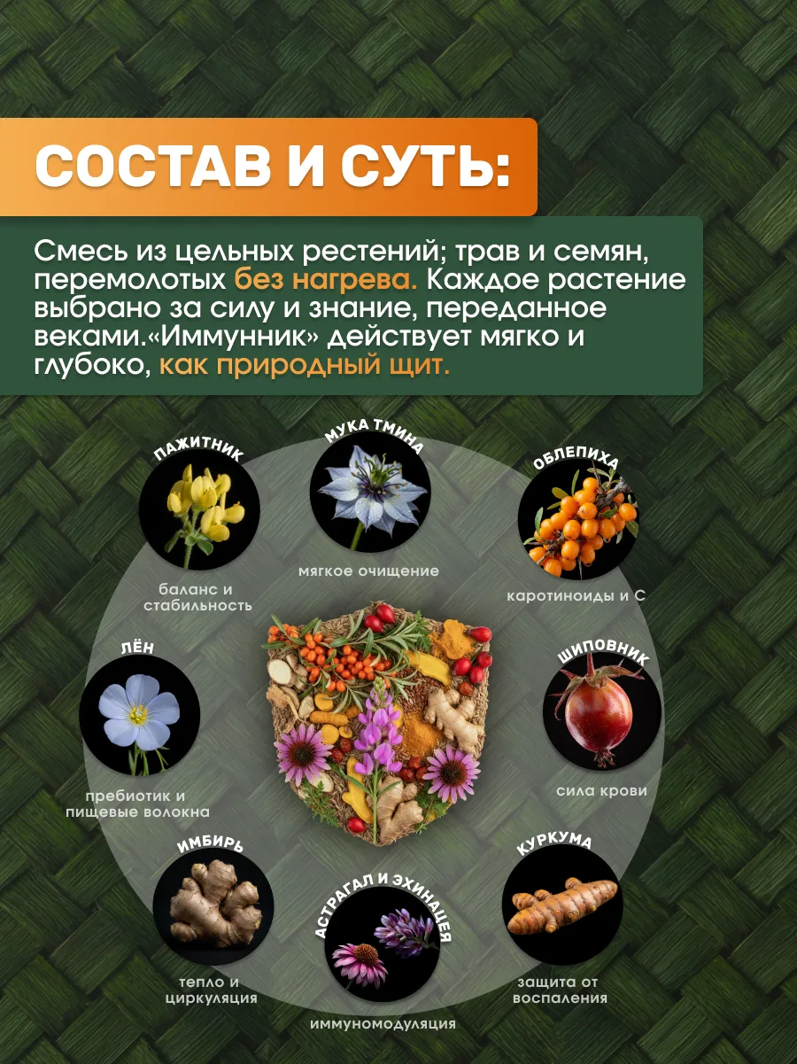
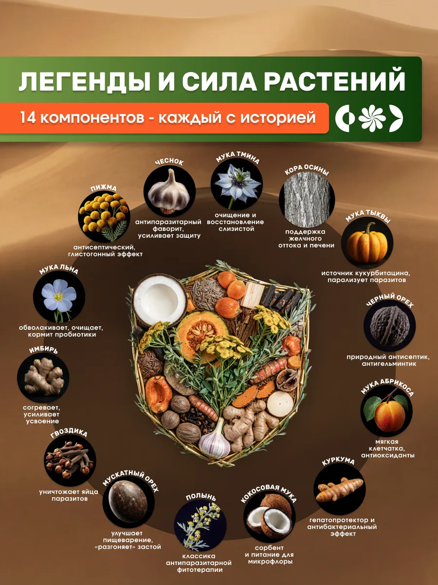
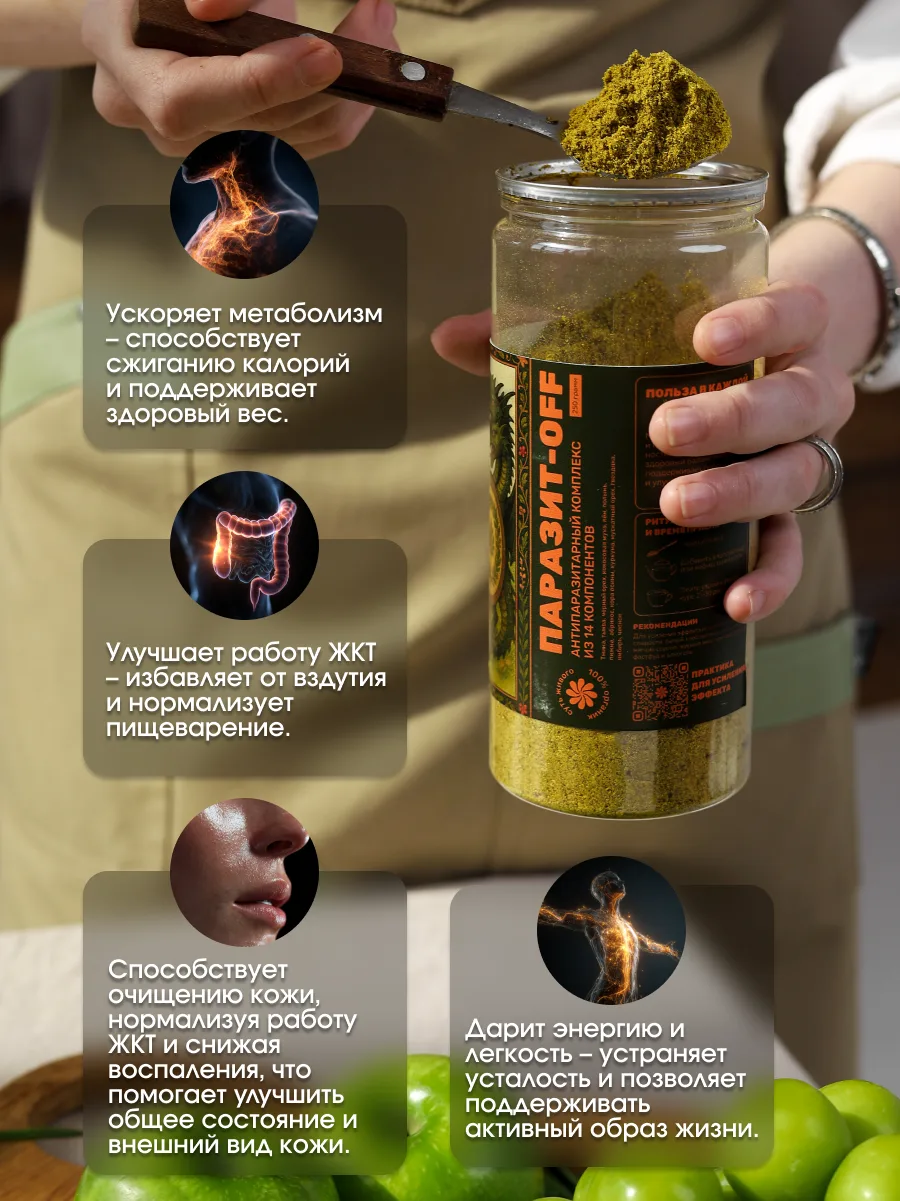
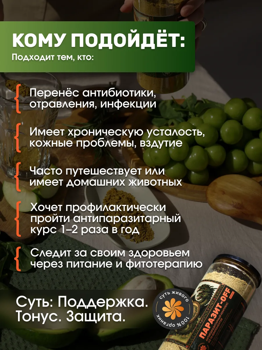
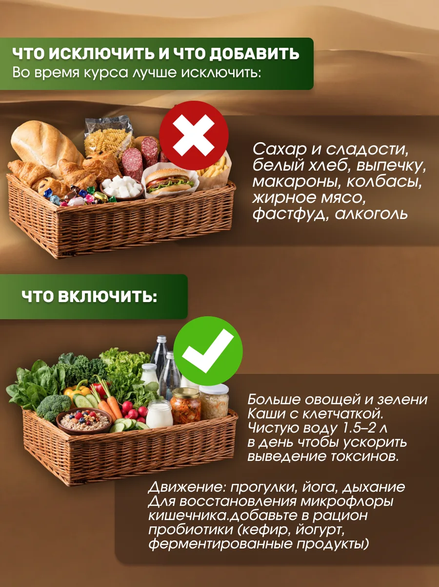
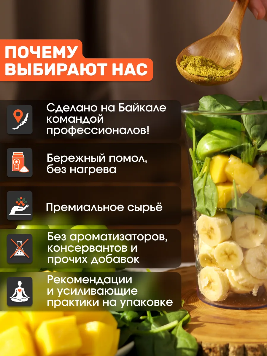
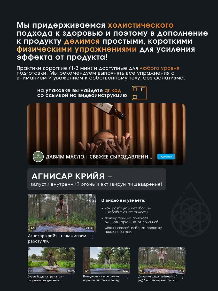
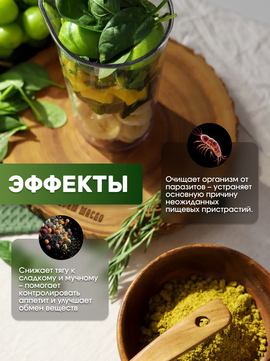
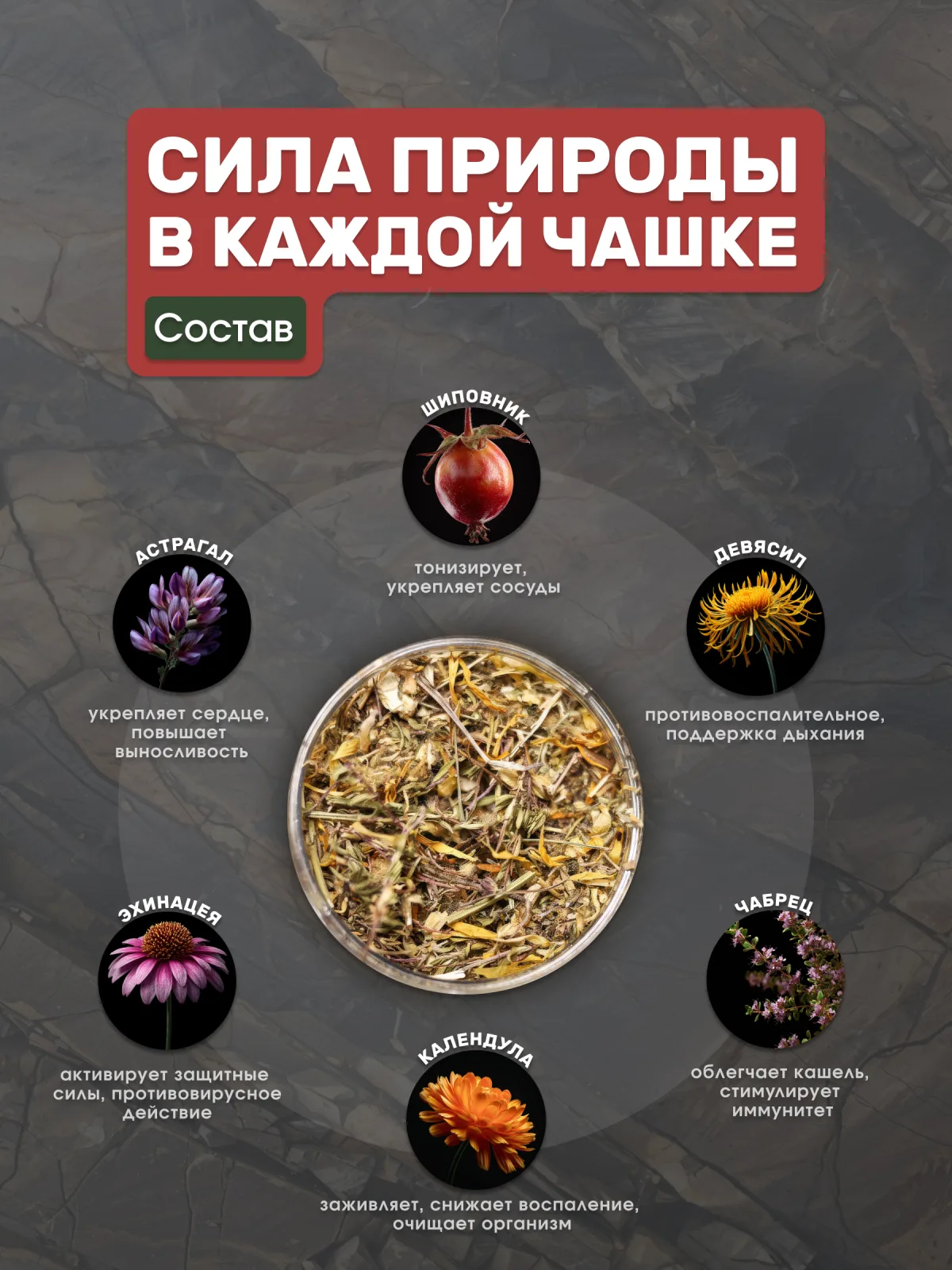
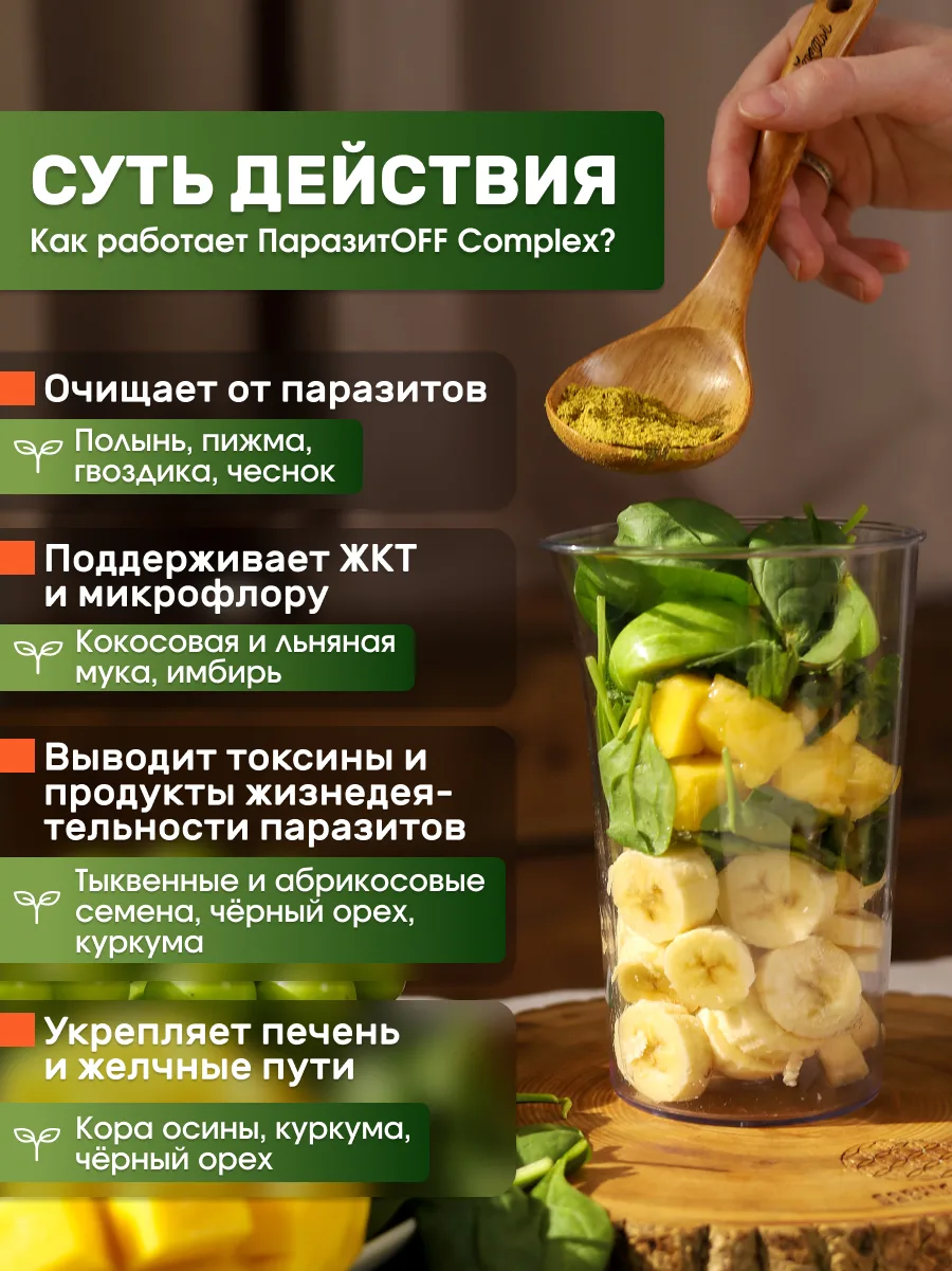
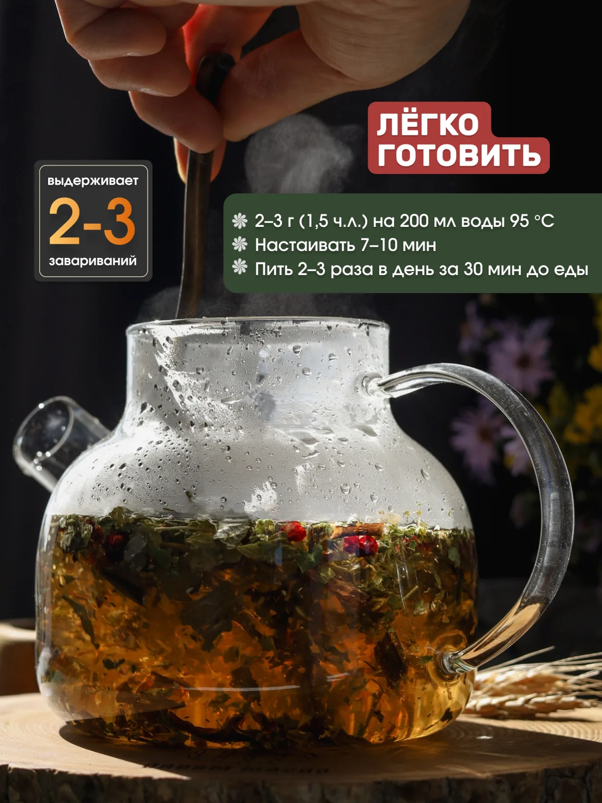
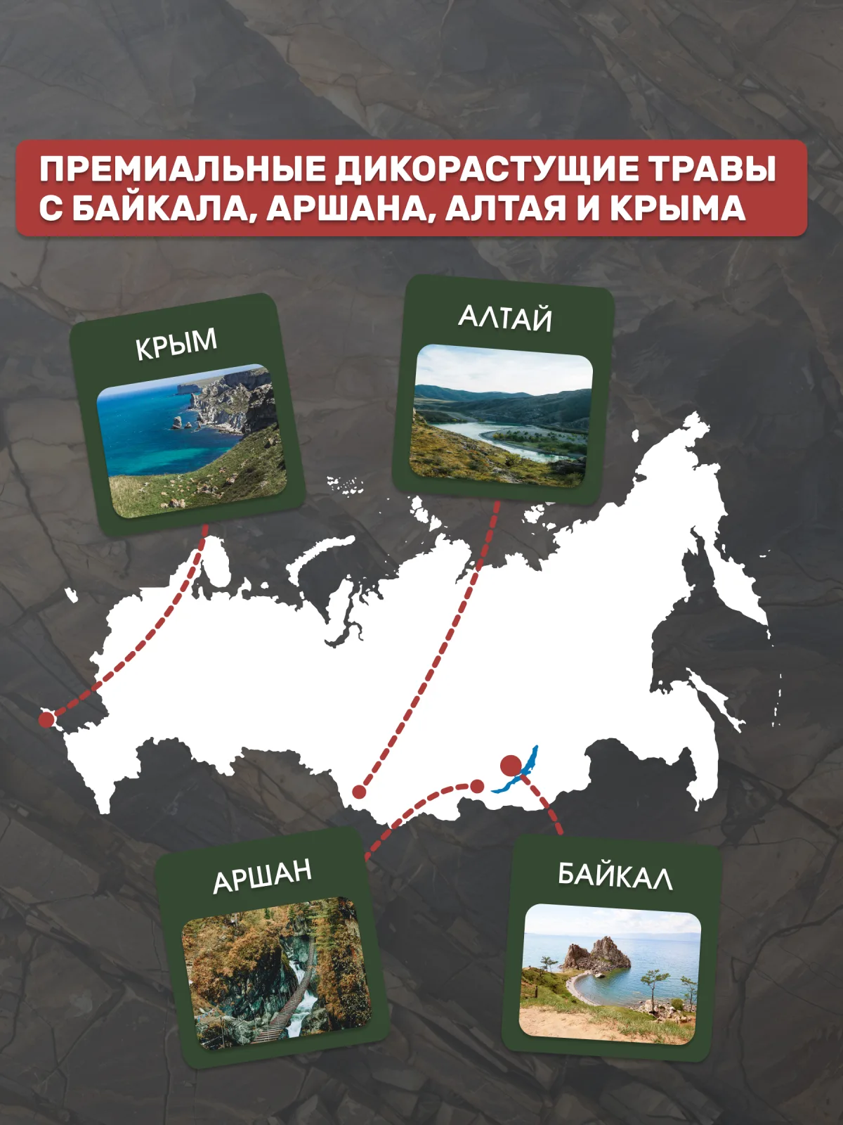
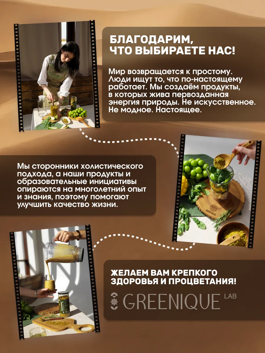
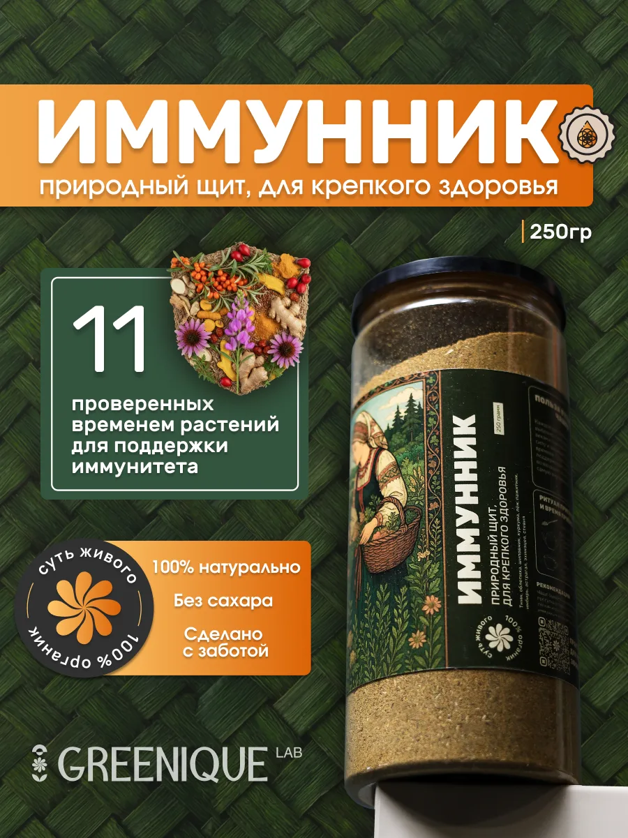
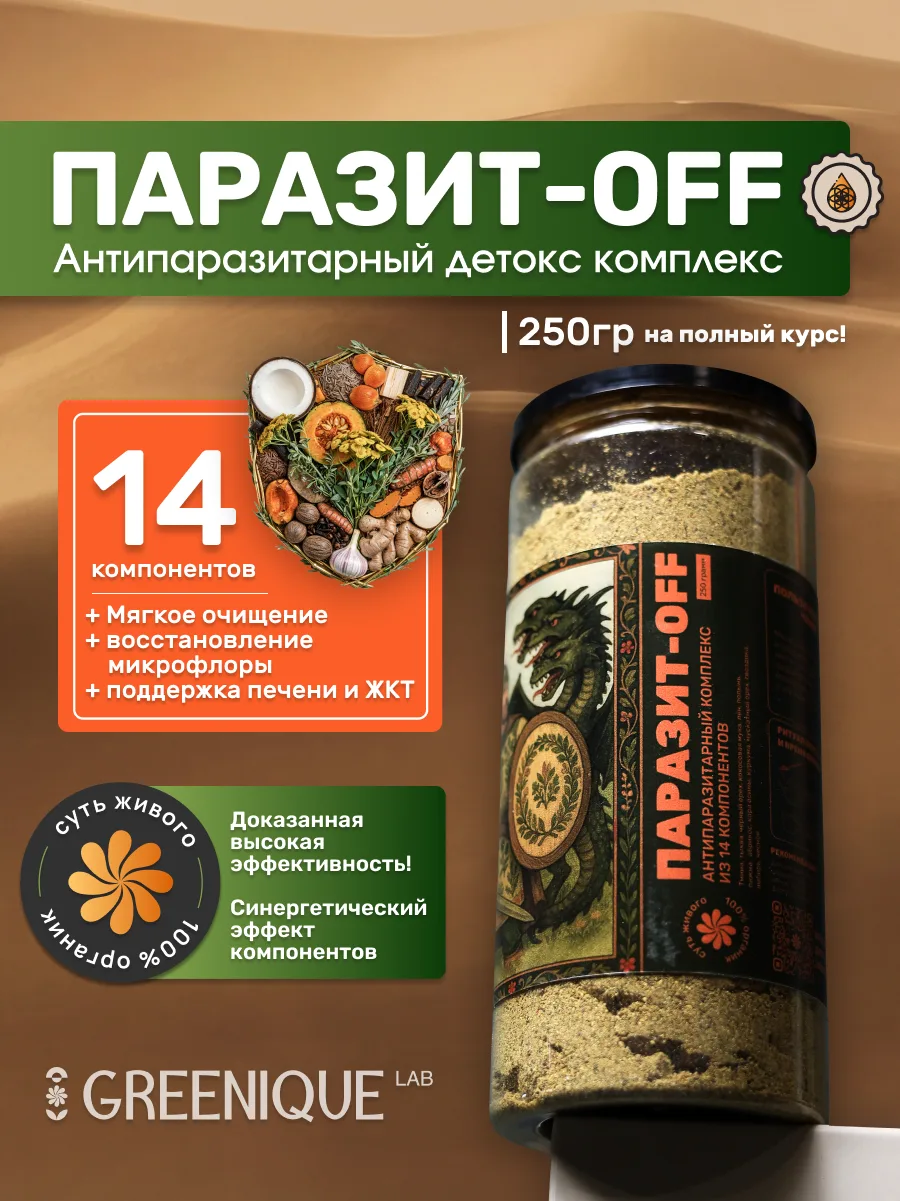
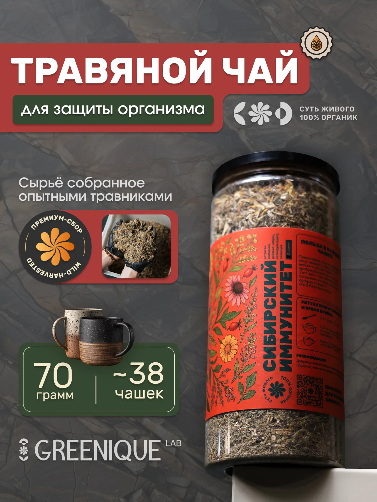
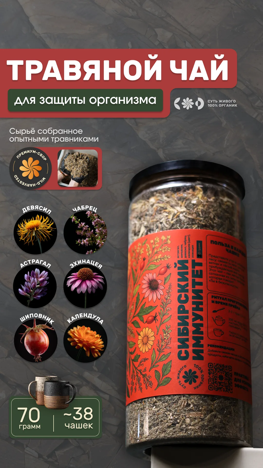
The gallery: ingredients, effects, who it's for, diet, brewing, the map of where it grows — and the hero cards for Immunnik, Parasit-OFF and Siberian Immunity tea.
Two Baikal brands, one shelf.
Since both brands belong to the same group, cross-posting and cross-referencing in the infographics and every other element came naturally.
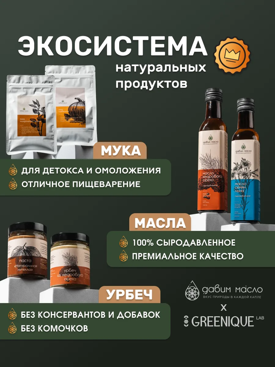
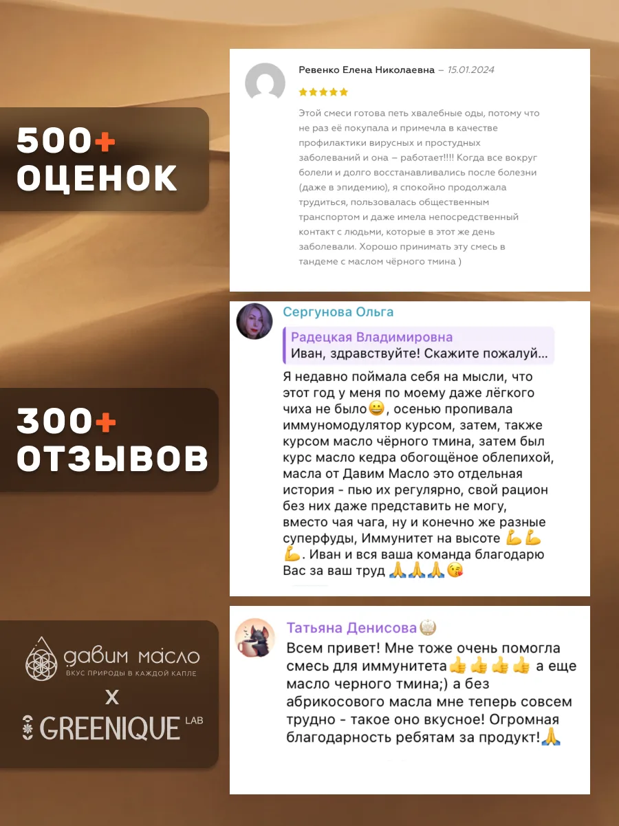
The joint ecosystem card, and 500+ ratings to back it.
So, yeah.
Another incredible philosophy and product line from the Davim Maslo owner. This guy is the archetype of wellness: lots of people preach something without applying it, but him? HE BREATHES HIS BRAND. And I think when someone creates a product because they actually want to use it, it’s immediately better. You wouldn’t cut corners or use bad stuff for yourself, right? That’s what makes his products defy the entire market.