Taiga Delicacies
The first company I worked with outside of Switzerland. I won’t lie and say this case made me famous, but it made big waves: just showing my work on this brand was enough to convince many others to work with me.
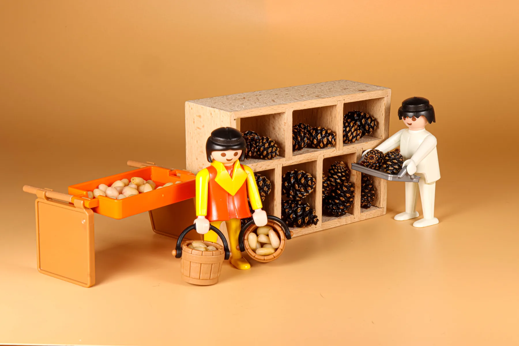
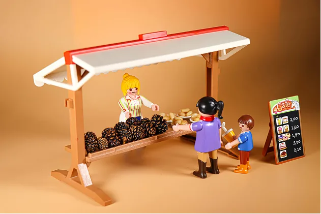
Iconic shots with Playmobil figures, illustrating work in their factory’s warehouse and sales at the street market.
The roots of my workflow — a methodology in the making.
The first thing I did was establish strong visual rules, adapting the colours of their products and of the taiga into what would become the brand book.
The bear I drew is still one of the most iconic pieces of this entire case, and I wish I could go back and correct that nose. I had never seen a bear up close before drawing it (later I got to pet one in Listvyanka, haha).
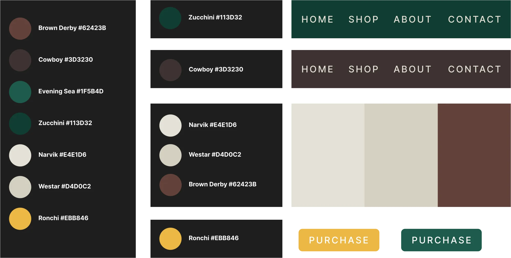

Taiga green, bark brown, honey gold — and the bear who keeps an eye on it all.
Legends of Baikal — legendary packaging.
After the amazing feedback on the bear, I made a series of premium tea packaging with handmade illustrations (vectors hand-drawn in Affinity Designer V2), and those boxes are EVERYWHERE around Baikal and Irkutsk. I’ve lost count of how many people have sent me a photo from their trip after spotting my work in hotels, souvenir shops and markets.
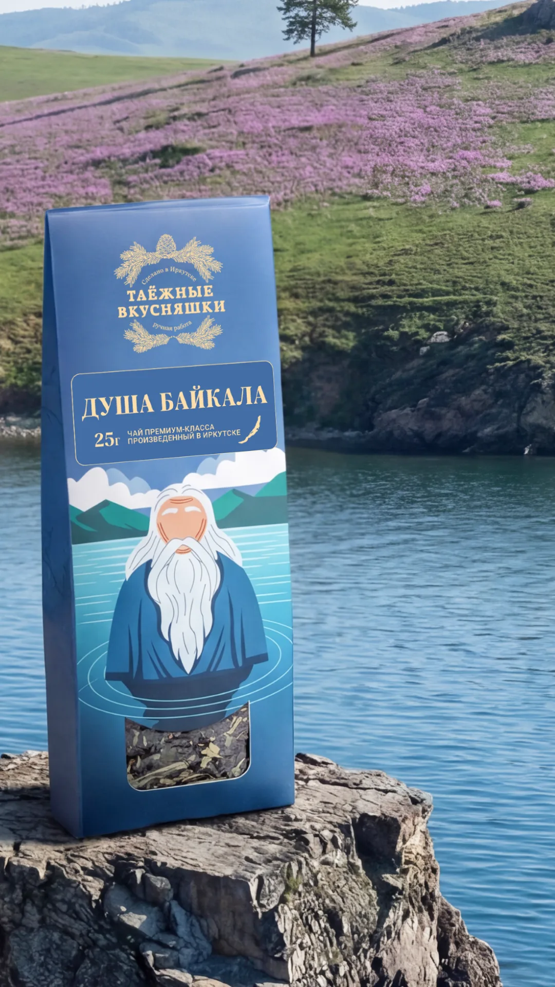
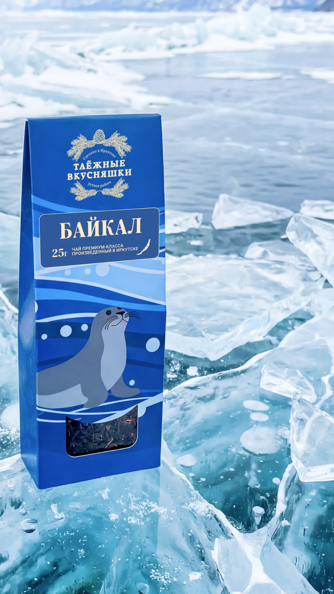
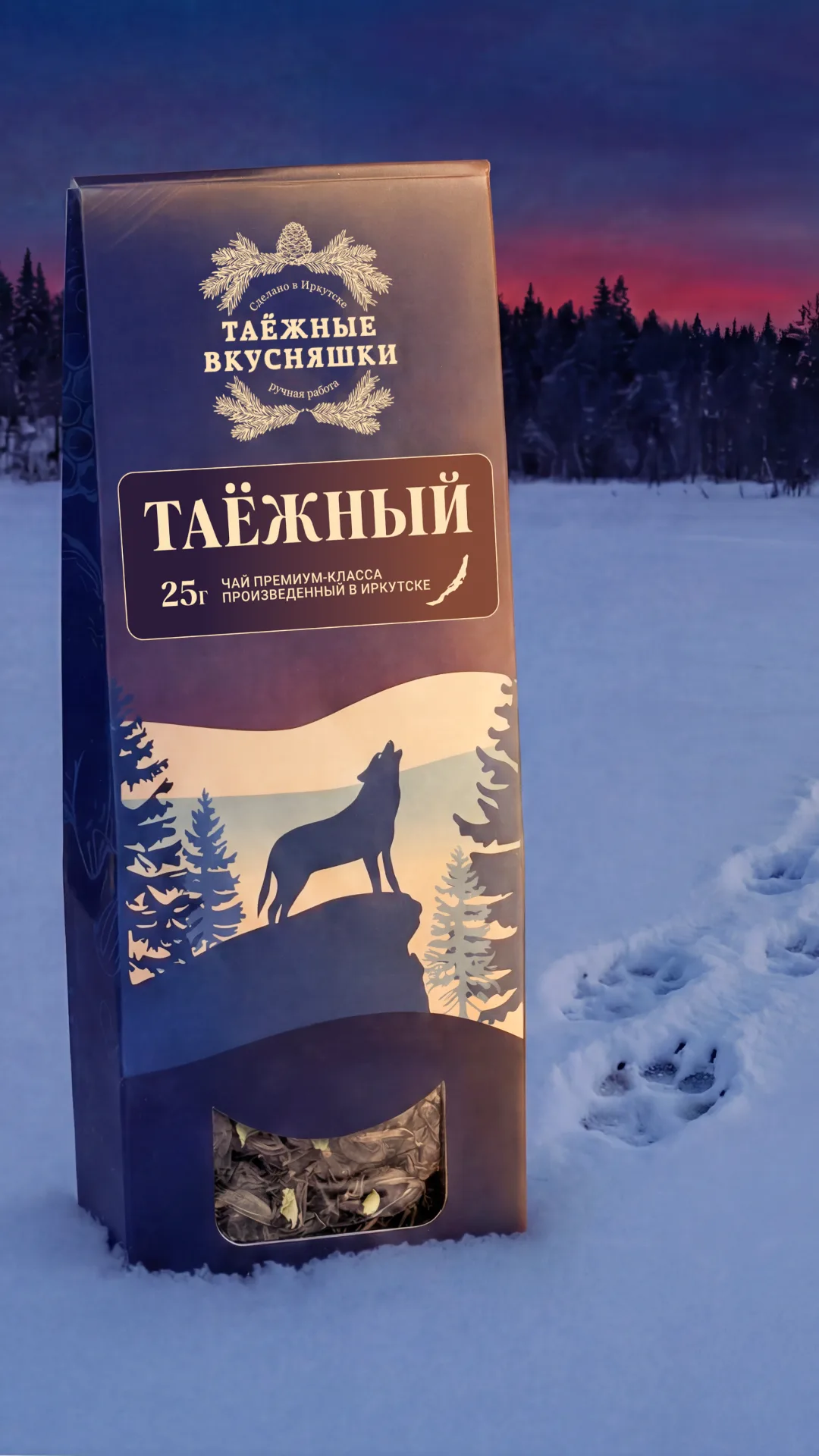
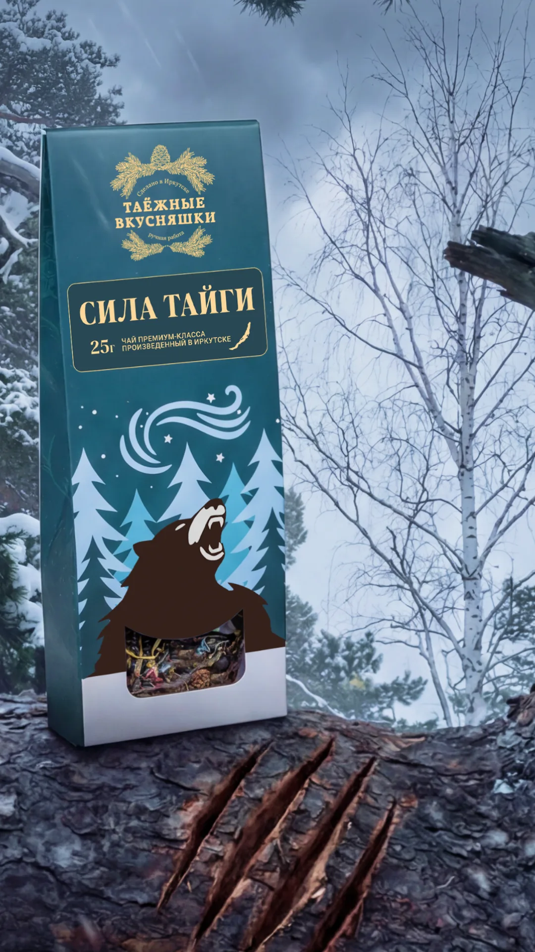
Soul of Baikal, Baikal, Taiga and Strength of the Taiga — 25 g, made in Irkutsk.
Marketplace infographics — high impact photos.
In a time when everyone and their mother uses AI to generate flying liquids and fruit exploding in every corner, I wanted to keep AI use to a strict minimum. The goal was to show the products as real and natural as possible, without the synthetic AI feel, for something that is literally FOREST TO TABLE. I still see those photos as some of the best I’ve ever taken.
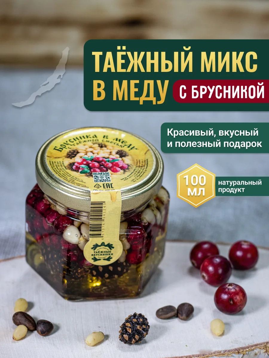
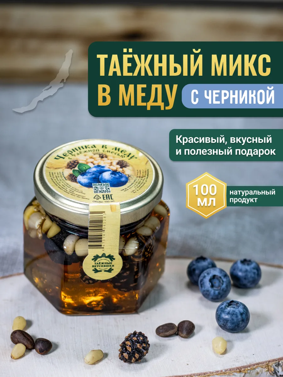
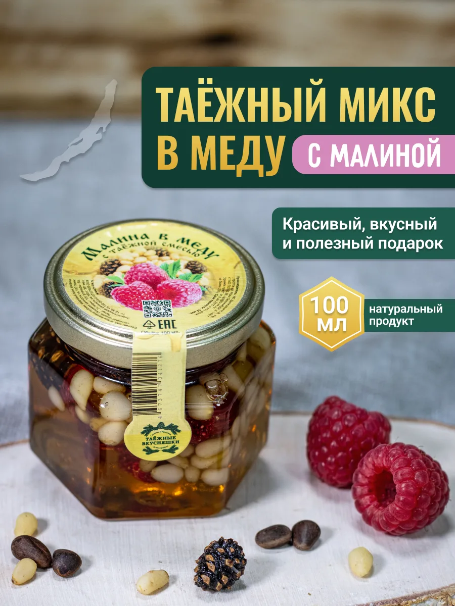
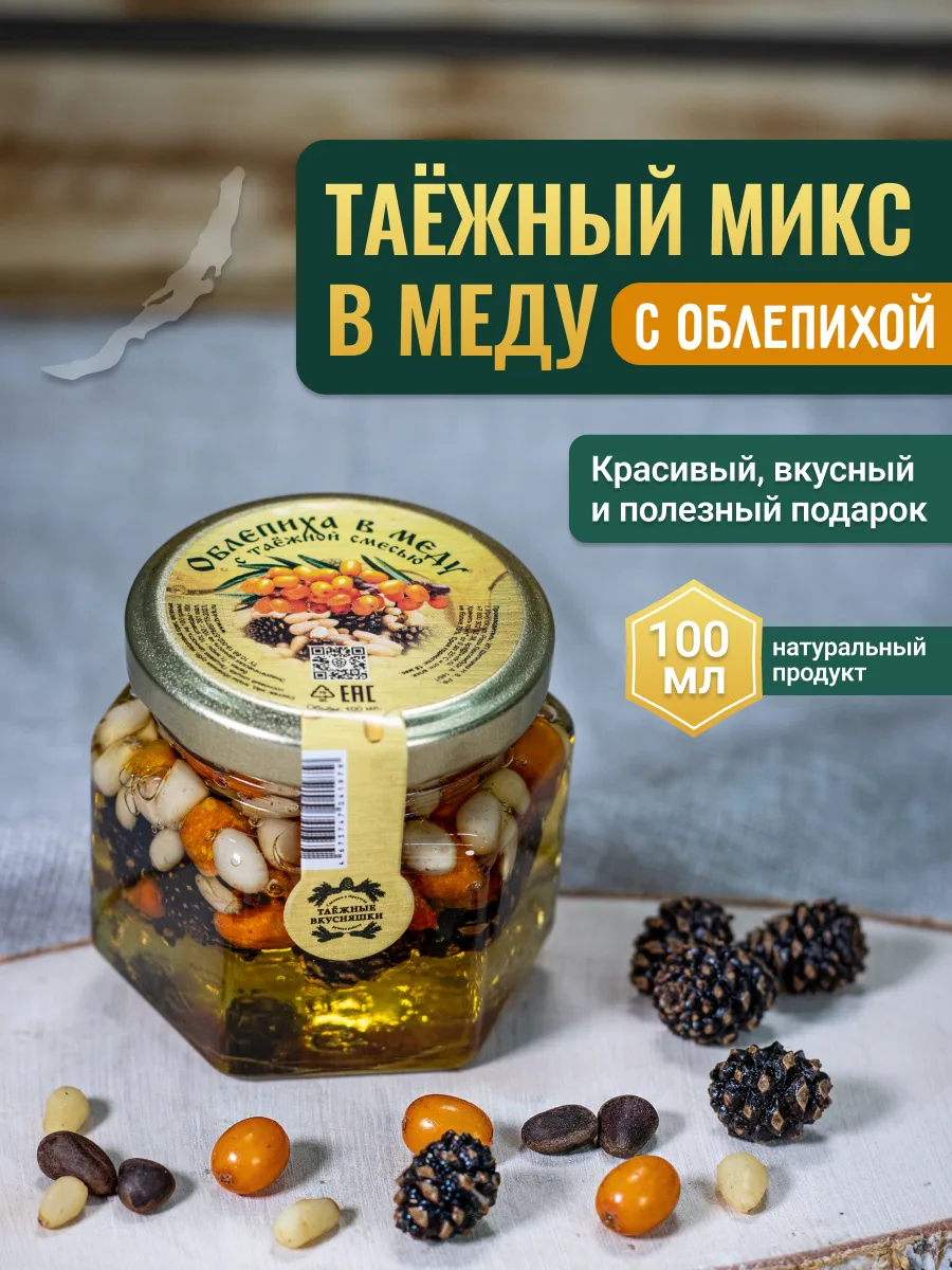
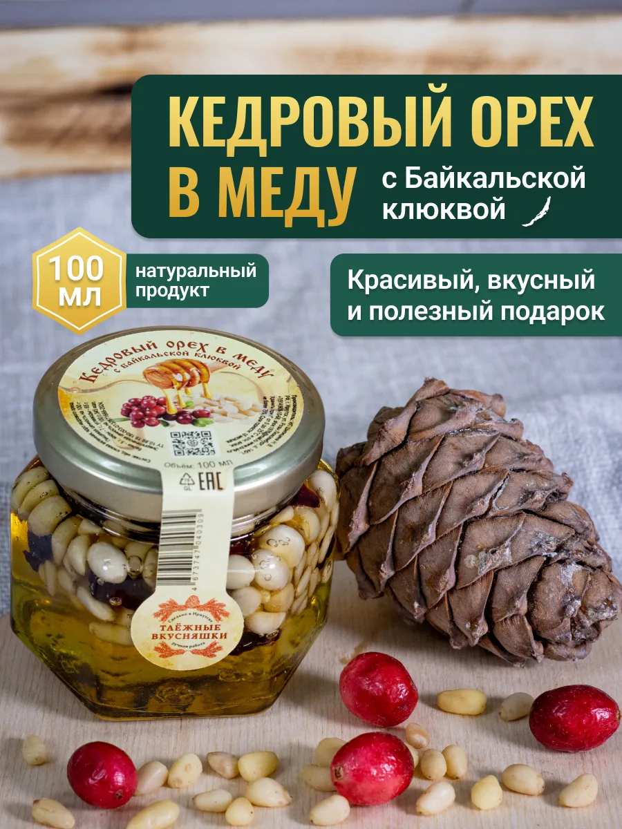
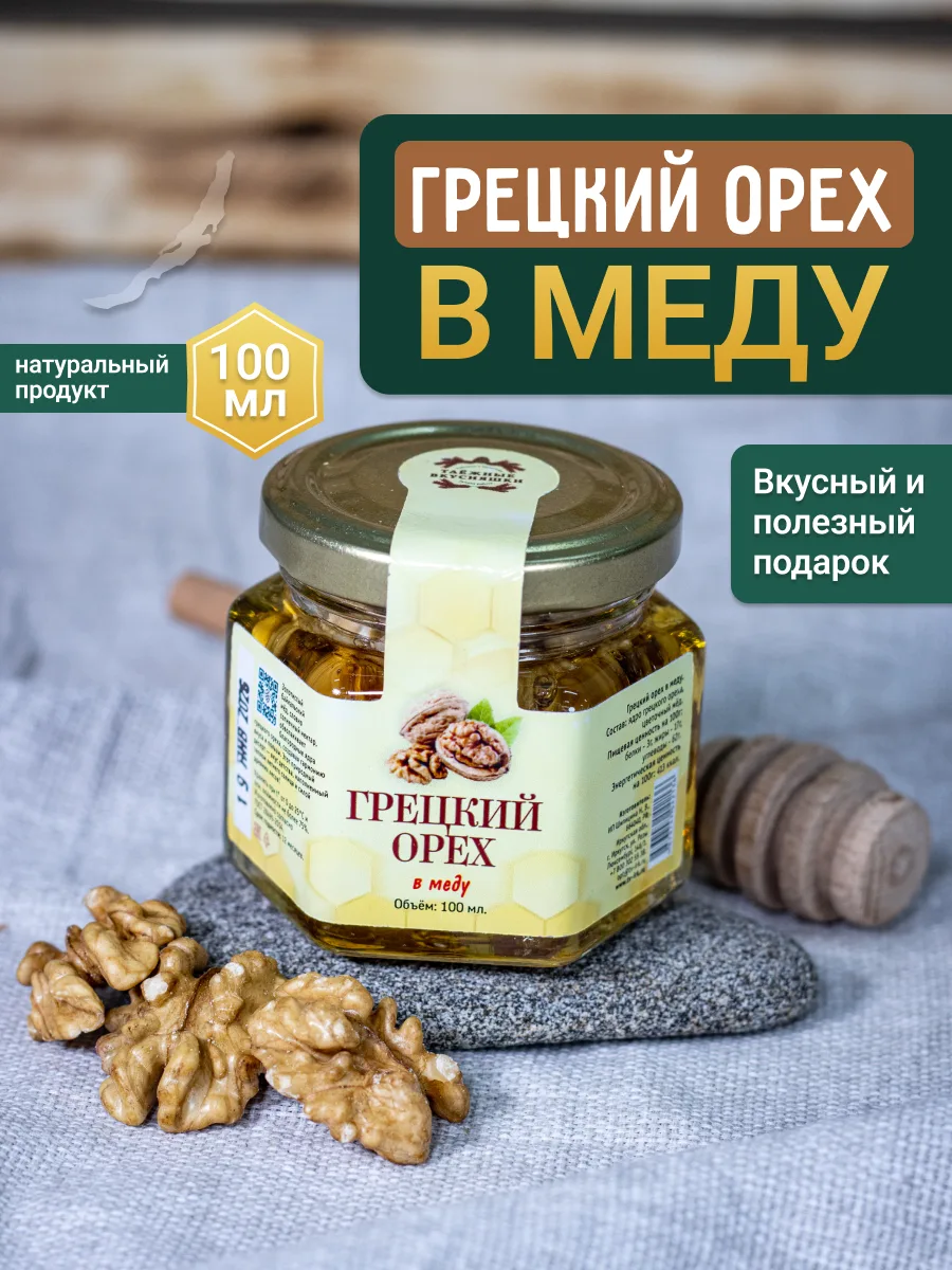
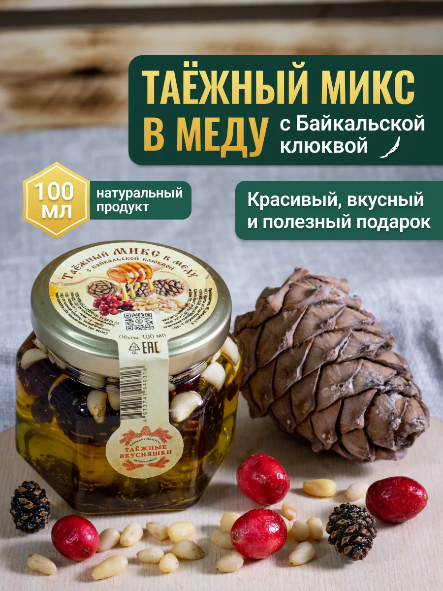
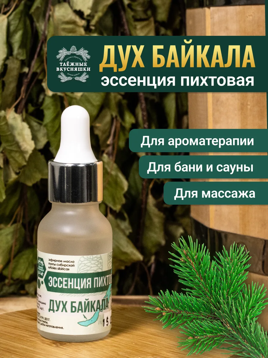
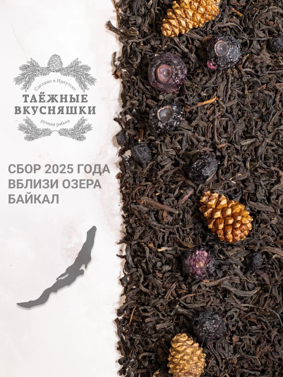
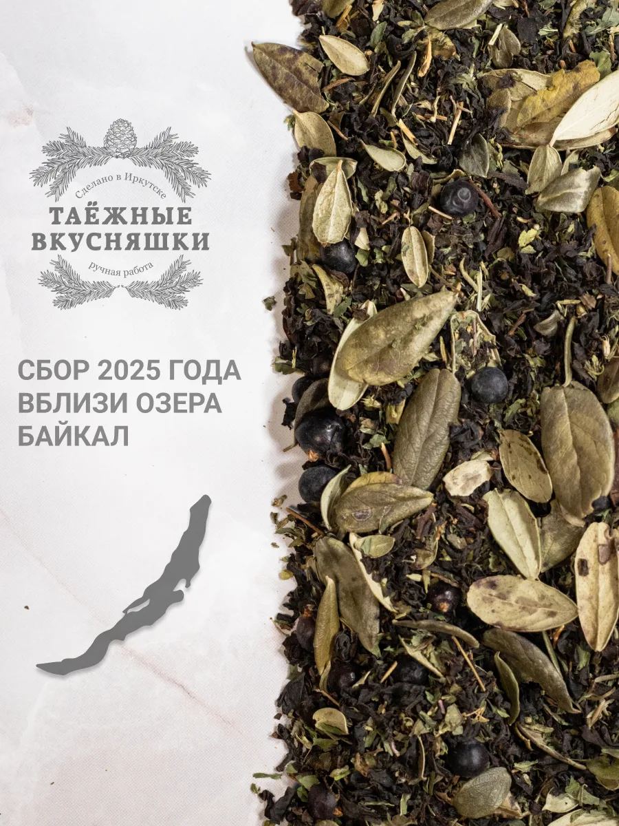
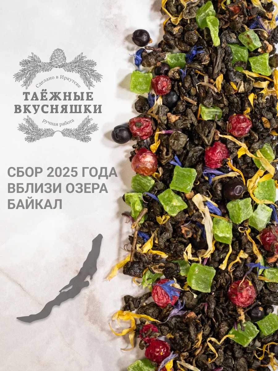
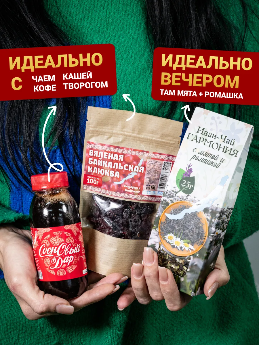
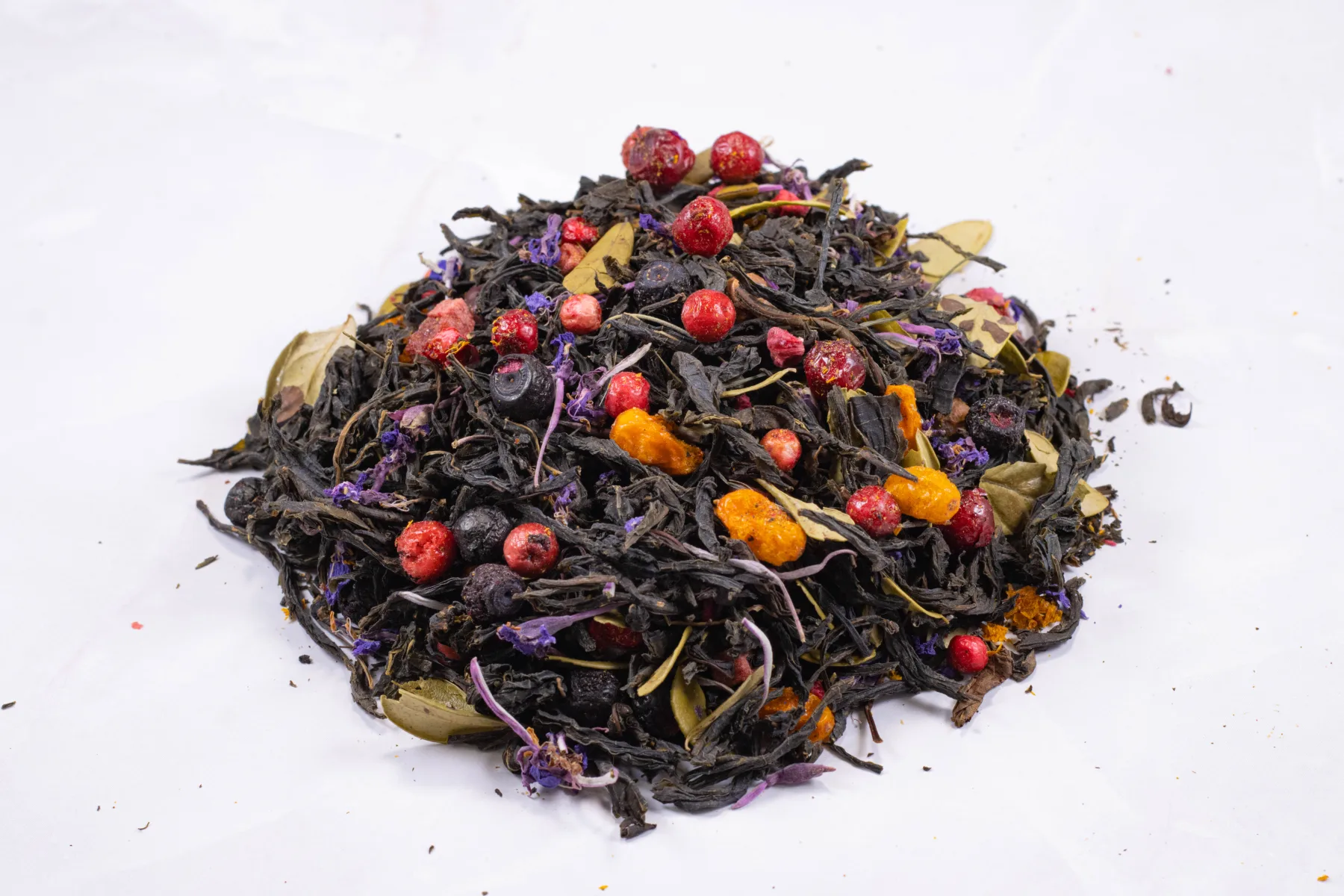
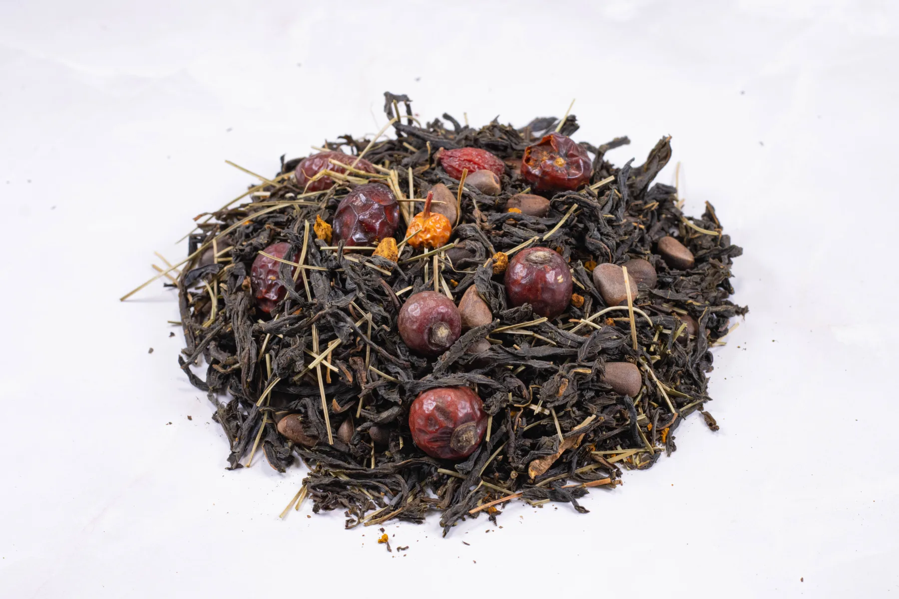
Taiga mix in honey — lingonberry, blueberry, raspberry, sea buckthorn, cranberry, cedar nuts — the teas up close, and what goes with what.
Prints and catalogs.
Here is an example of a seasonal one-page, double-sided catalog (disregard the product names I copied over and over: I gave them the template so they could edit all the text).
And a page of advertising I made, featuring my photos, that the brand ran in Komsomolskaya Pravda (I later made a magazine cover for them, but that’s another story).
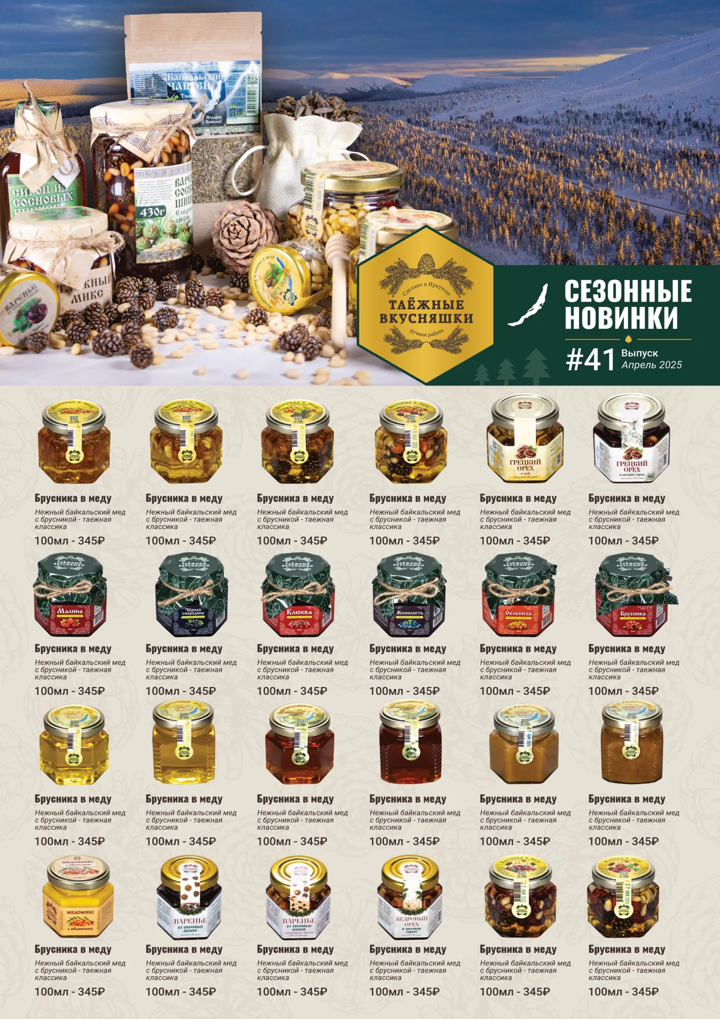
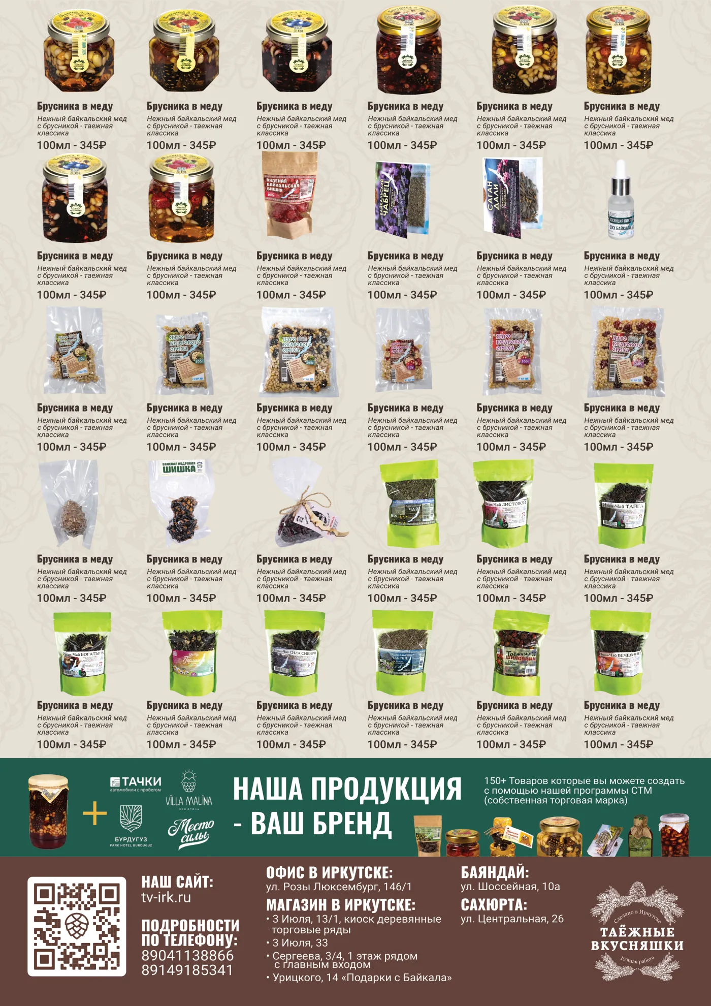
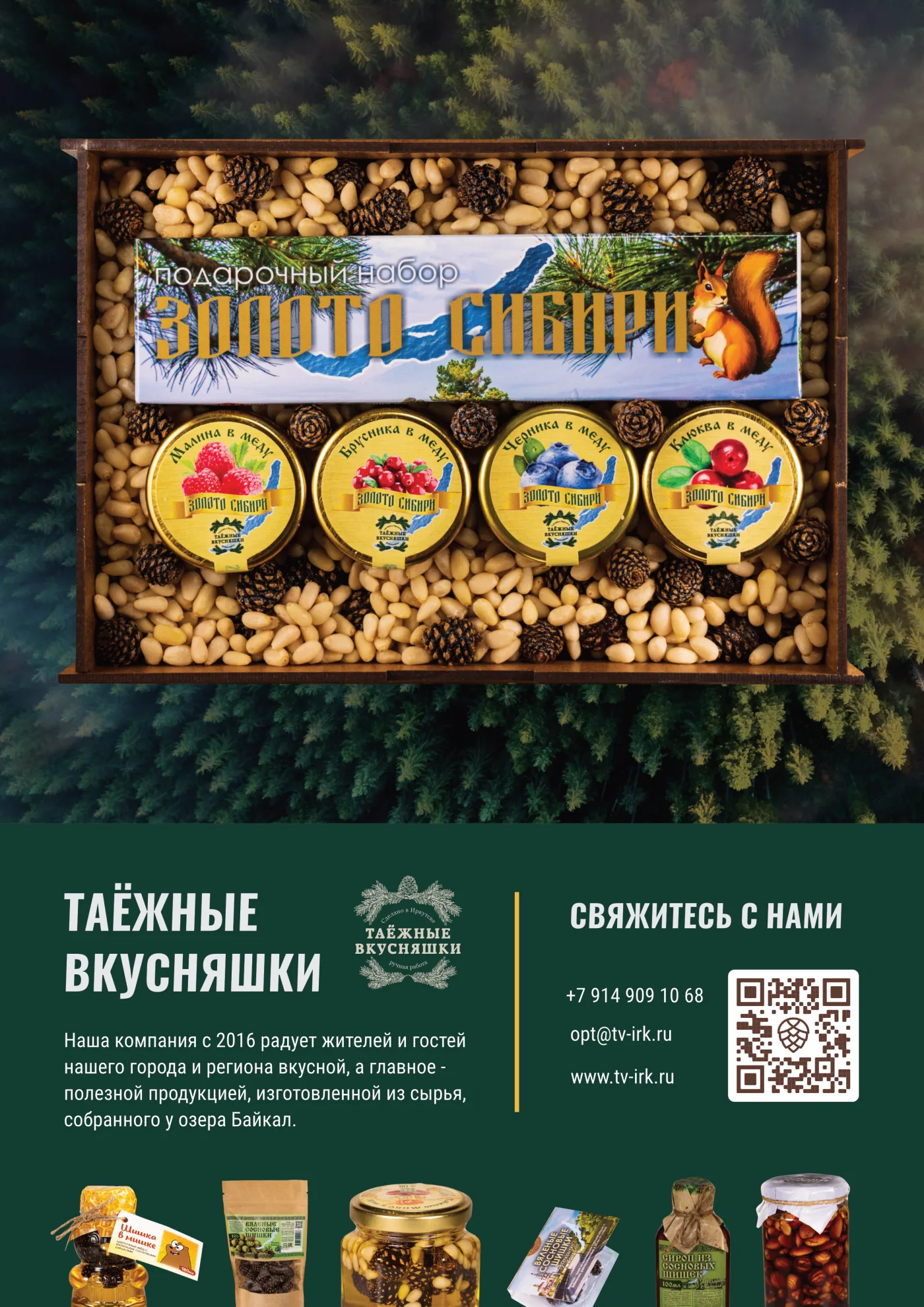
Seasonal new arrivals #41, the full range with store addresses, and the gift-box poster.
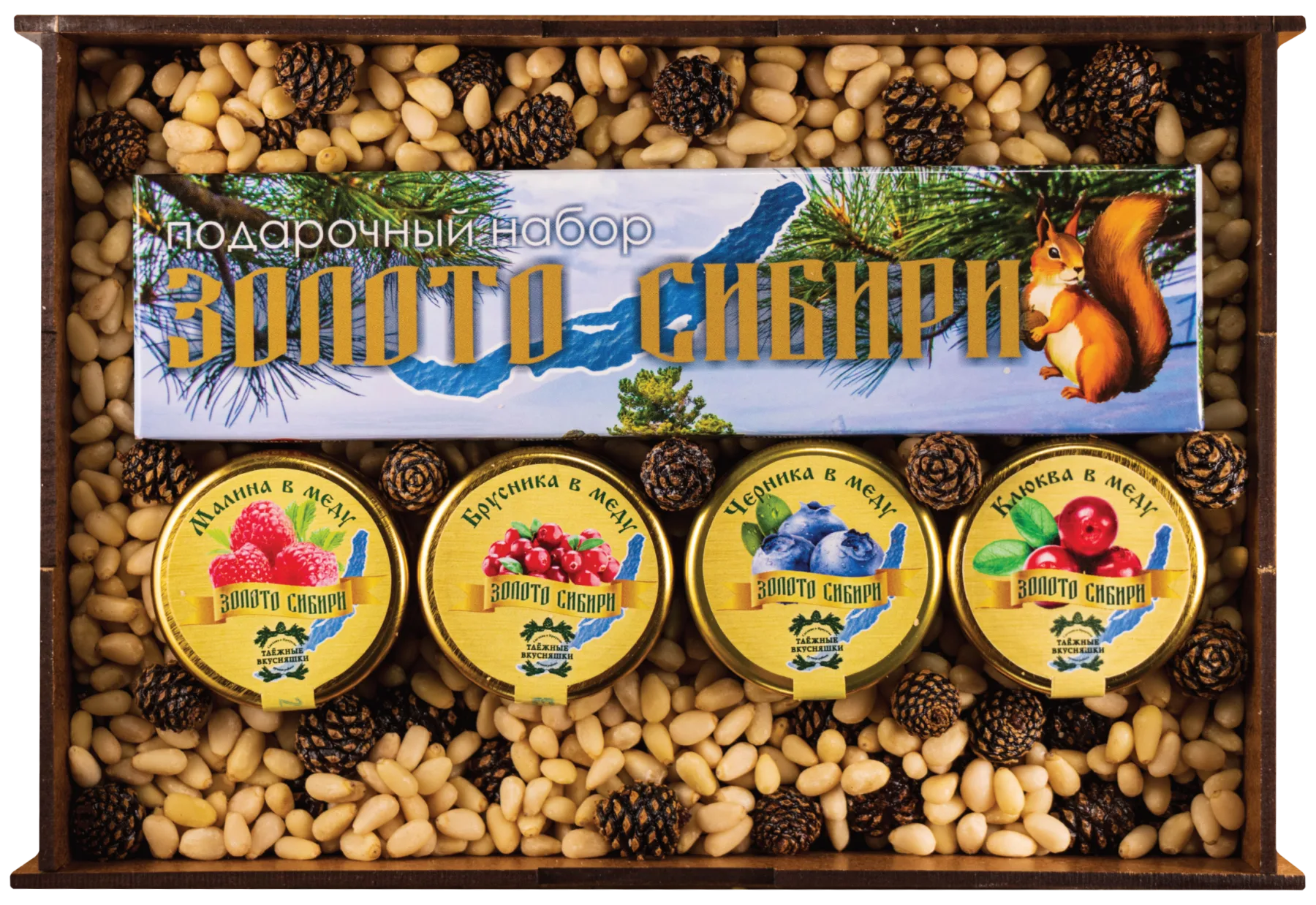
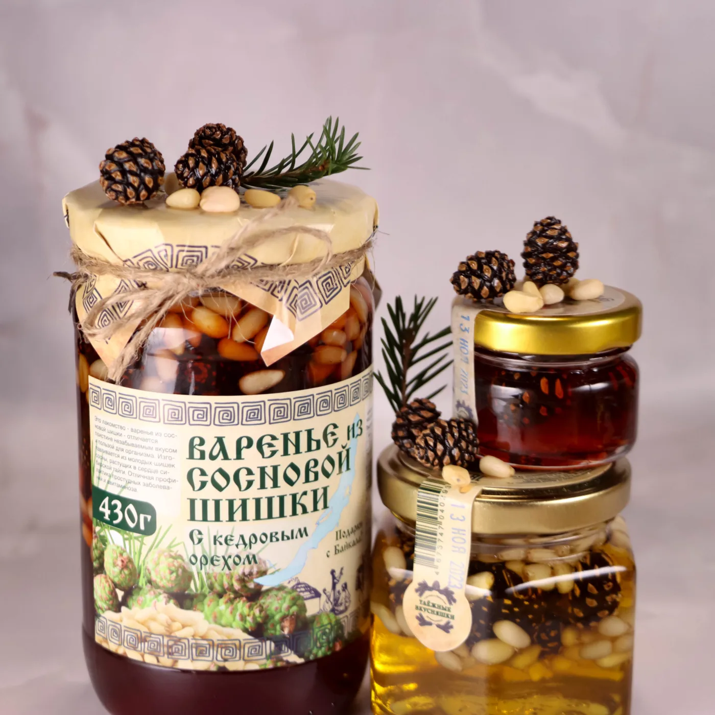
Golden Siberia: four berries in honey, bedded in cedar nuts.
Stories for people who've never been to Siberia.
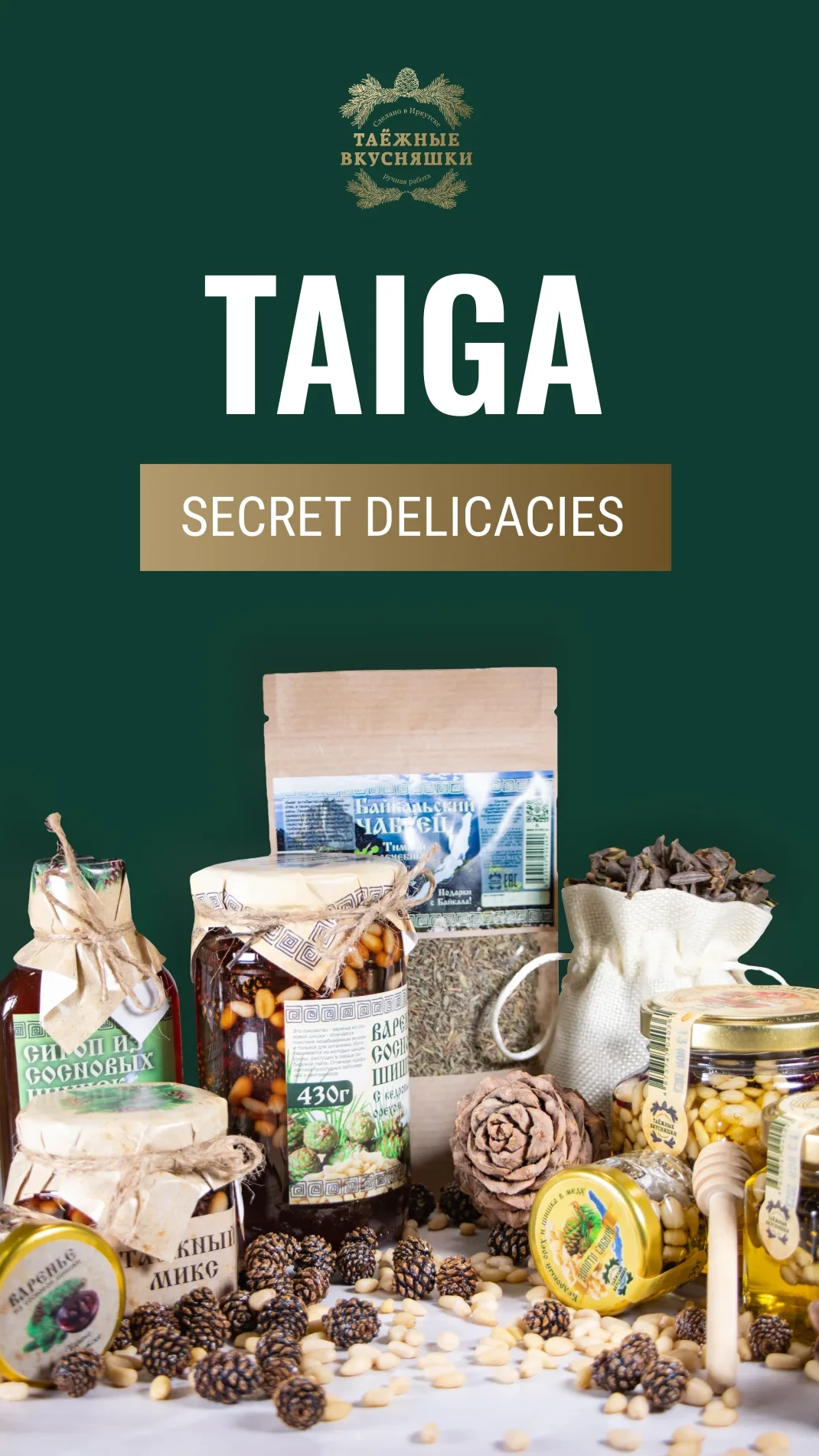
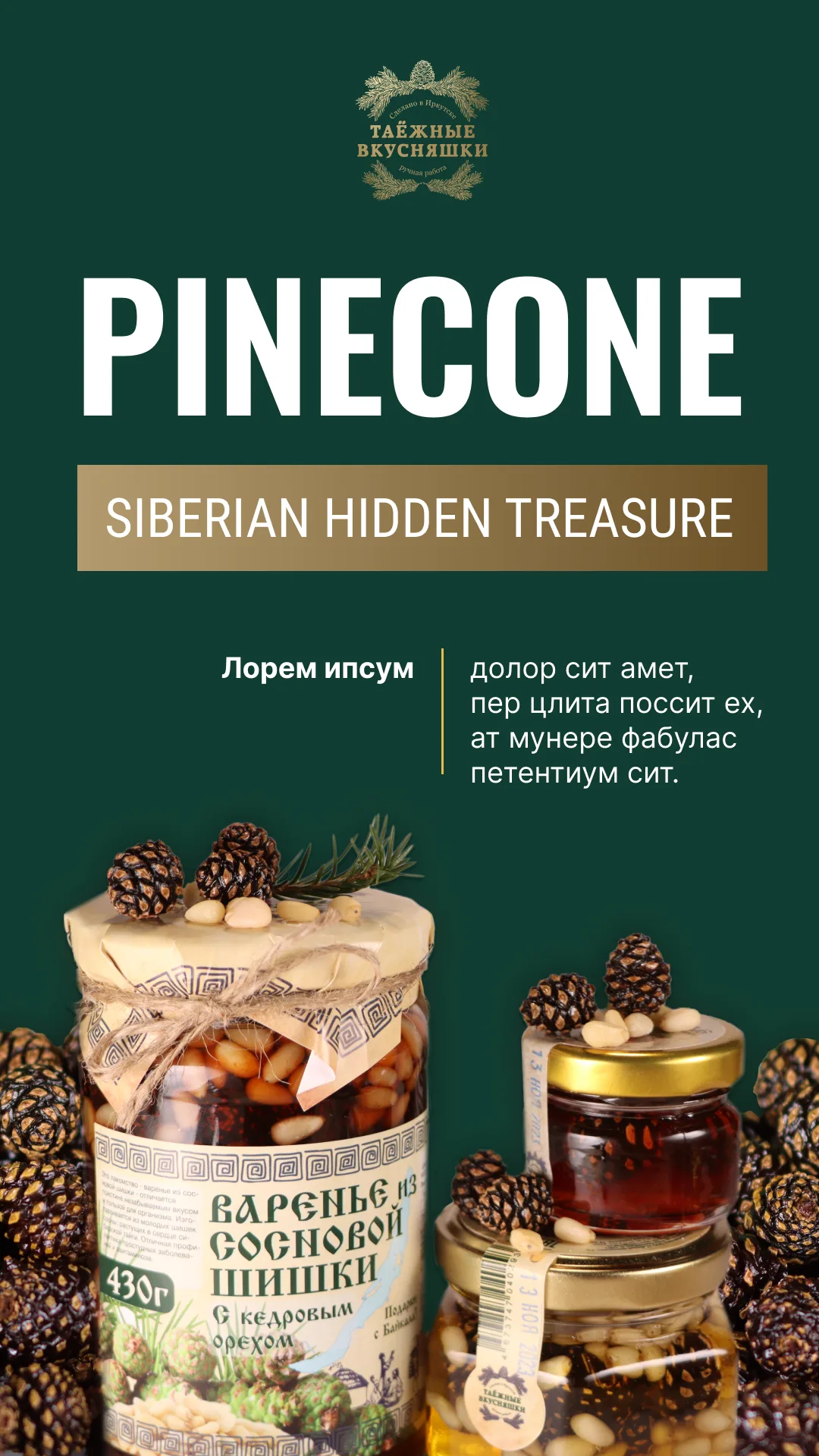
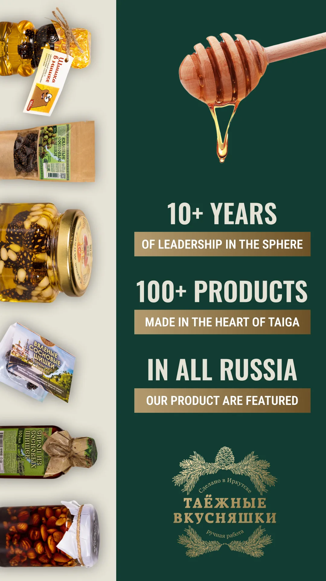
Taiga, Pinecone, and ten years in three lines.
High impact AI graphics.
Just some high quality AI visuals I made from my photos, to get some unusual, “alive” shots.
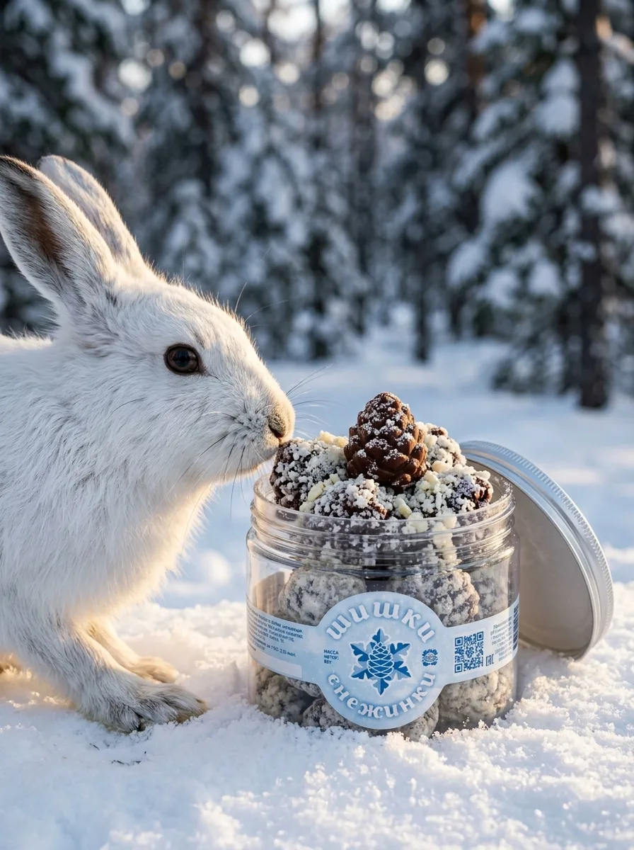
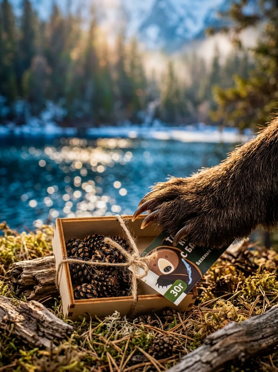
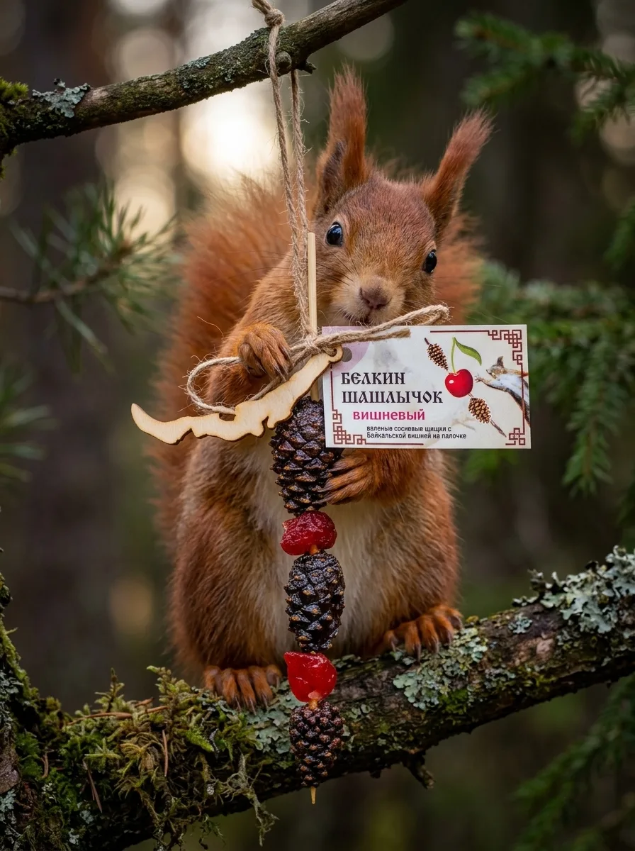
Snowflake cones, dried cones from Baikal, and the squirrel's cherry skewer.
Forest to table.
I don’t think I have ever seen anything as natural as this. Most of the production comes from the forest, not from stressed plants in monocultures. It was a surreal experience to see such high quality, delicious produce coming straight from the wilderness of the Siberian taiga.
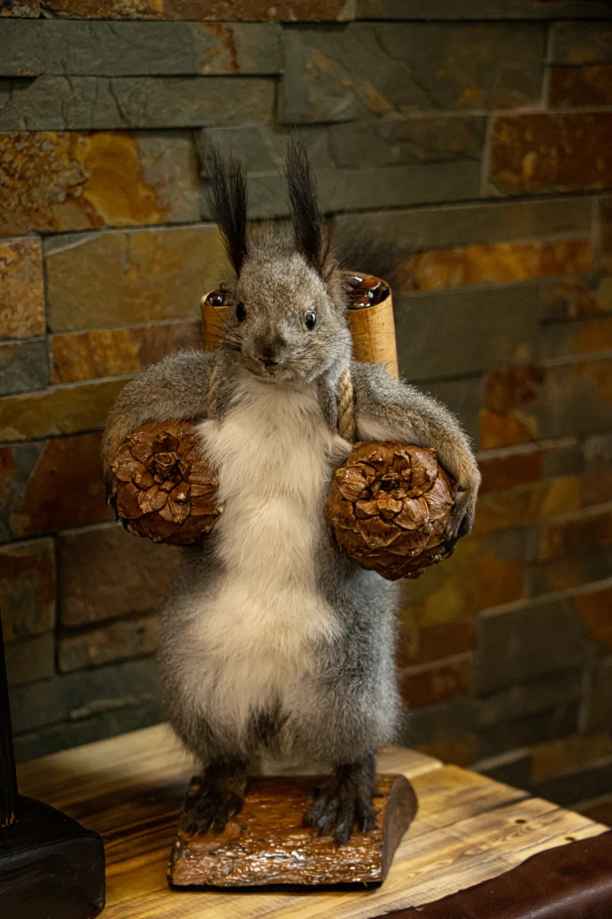
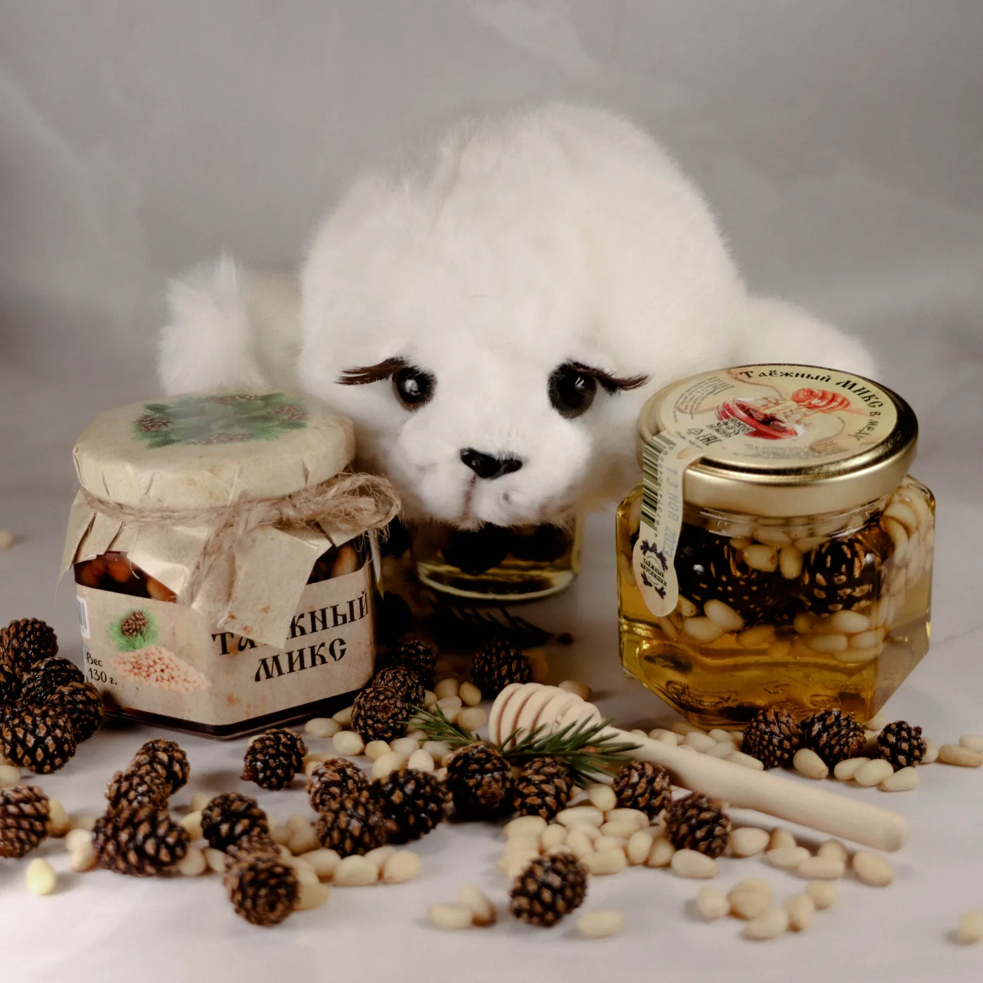
So, yeah.
Oleg, the brand owner, is a very special person. I learnt a lot about making deals, concessions, sharing and general Slavic business etiquette by observing and listening to him.
And of course, I’m forever grateful to this brand for working with me when I was still a travelling nobody looking to collaborate with foreign brands. The first brand outside of Switzerland I worked with.